About a year ago I wrote a post for the cover of the first book in this series entitled “Tab Bennett and the Inbetween”. That cover was a serious composite too, and because I never did get around to writing it up for the blog I thought I’d take the time to let you all behind the curtain for the making of the second one.
I should point out that Underneath, Princess of Twilight & Dawn will be out in the Amazon Kindle book store on December 30. I’ll be sure to update the post and let people know where they can get it.
The author Jes Young and I sat down and talked through some ideas for the second book. Just to get you up to speed in case you haven’t read the first book (which you should, here’s the ebook on amazon), the main character Tab was a young woman whose sister had died and is just learning the truth about who she was, which happened to be an elf princess with a destiny. On the first cover we visualized a scene out of the book where she’s walking from her house toward toward an apparition in the woods at twilight, and starlings are flying around over her head.
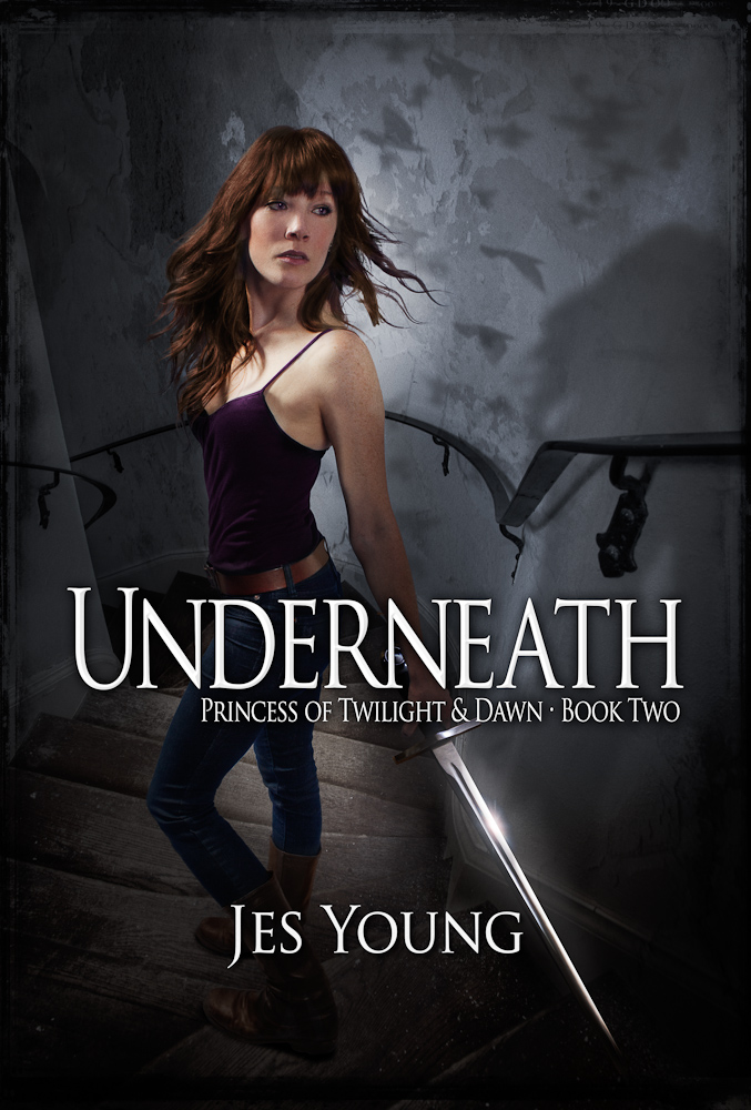
For the second, somewhat darker book (think The Empire Strikes Back), Tab is journeying down into an underworld to confront her evil father. We thought that a downward spiral staircase would be a great visual since it is a significant part of the story line. Tab would be dressed a big sexier, be a bit more badass, and be holding a bladed weapon of some kind. I liked the idea of making her pose similar to the first cover, with Tab walking down the steps, but looking back over her shoulder for danger. It would bring some continuity to the series.
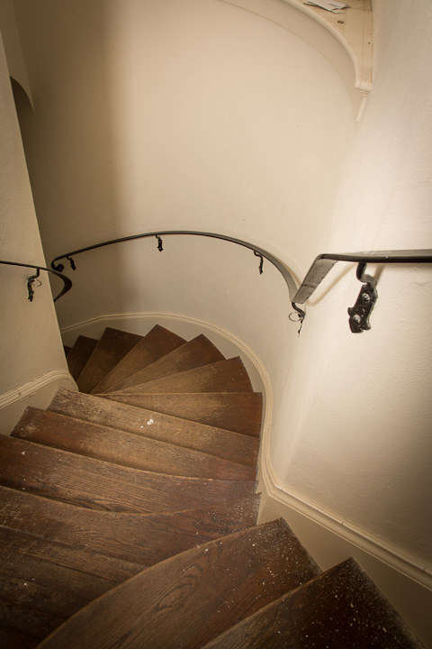
The first challenge for this project was to find a spiral staircase. It’s a surprisingly difficult thing to do. But Jes (or course) has a friend who happens to own a castle, Osborn Castle at Cat Rock up on the Hudson to be specific. So in the fall, I took the train up with camera to shoot scenes and elements which I could later mix together for a background plate on which to build the composite. I’d like to take this moment to say that this place is BEAUTIFUL and a special thanks goes out to Fred for being so gracious and letting us use his property.. So if you’re fancy and looking for a place to have your wedding or similar gala party, then Cat Rock should be on your short list. Fred was kind enough to give us a tour of the grounds and the house. When we mentioned staircases, we were told there was one off limits to the public up on the third floor. As it happened, it turned out to be perfect for what we needed. I set up my tripod at the top and took this picture. It’s severely wide-angled (28mm) and I know that the perspective is going to be exaggerated, but I’m ok with that because it will just add to the intensity of the final result.
Pretty boring right? Too bright, cheery, and far too clean for what we needed. That’s ok, I can deal with that in post. The important part is to capture the crazy meandering stairs.
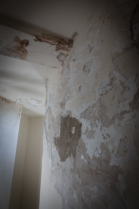
What I needed was a way to grunge it up a bit. Sometimes, taking pictures of uninteresting things can be a real lifesaver, case in point: I had a picture in my library of an old plaster wall whose paint was cracking and flaking off. It looks like this.
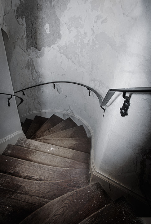
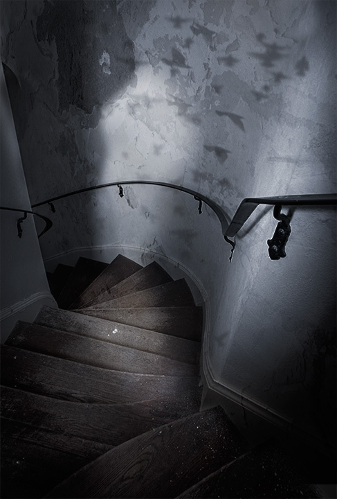
I used this detail stretched across the original stair shot in overlay blending mode, which made the two appear to merge into one foreboding stairway into the unknown. Here’s what that looked like.
Simple, right? Well it kind of is. It may not be perfect, but because we’re going to do so much more to this composite before we’re finished, it’s ok for the moment. The next step is to make scene darker and creepier, and make the lighting far more blue than the original shot. In addition, I wanted to sculpt the light a bit to give the impression of a final window with dusk or moonlight coming in from left to right.Jes had also requested that we bring in the birds from the cover of book one, so I added that detail in. That leaves us with this:
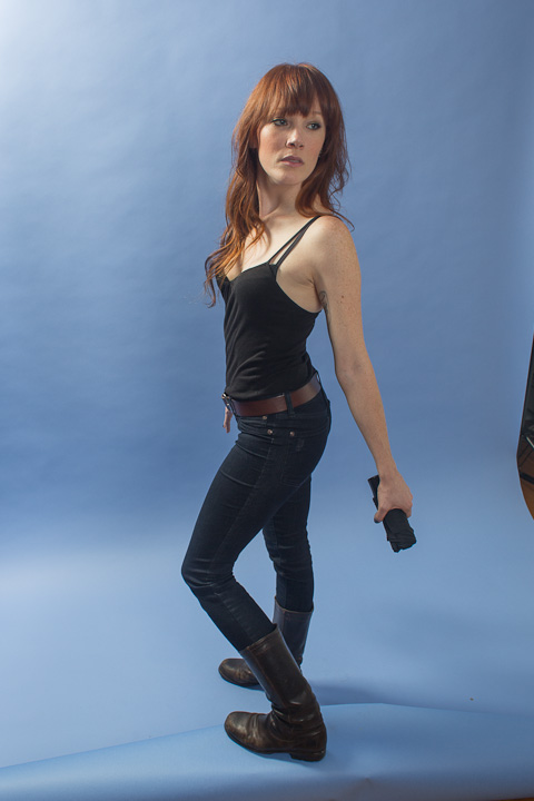
Notice that there are some lighter areas in the middle, that’s where I am planning to add the model. Thenext step was to get my friend Mary to model as Tab. I pulled out some blue paper to make it easier to mask her out, set up a couple lights (one for fill and another to mimic the light coming in the window), and set up a box to act as the step for Mary to stand on so that her feet and positioning matched as much as possible.
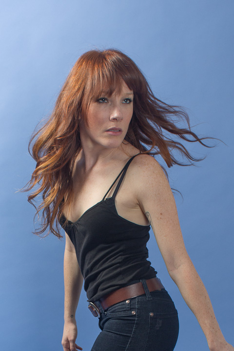
You can see that I didn’t have a sword for Mary to hold. I couldn’t get it in time, so we had to make due with a small umbrella as mock sword hilt. I was happy with her expression and the angle of her body, but we added some later shots which had much more dynamic hair, so that it would look like she was whipping her head around because she heard something behind her. So-(delete) I looked through the shots and composited the hair from a later shot onto this one. Here’s a crop of the hair shot.
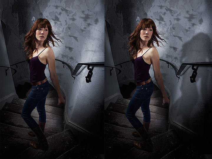
Now it was time to bring Mary into the background. I actually-delete had pretty-delete decent luck using a mask and the built-in refine edges commands in CS6, which surprised me because they have rarely worked for me in the past. So-delete Here’s Mary against the plate, with and without the shadows. Look around her feet on the shot on the left and you’ll see how pasted in it looks. Matching shadows and light are the key to making shots like this work.
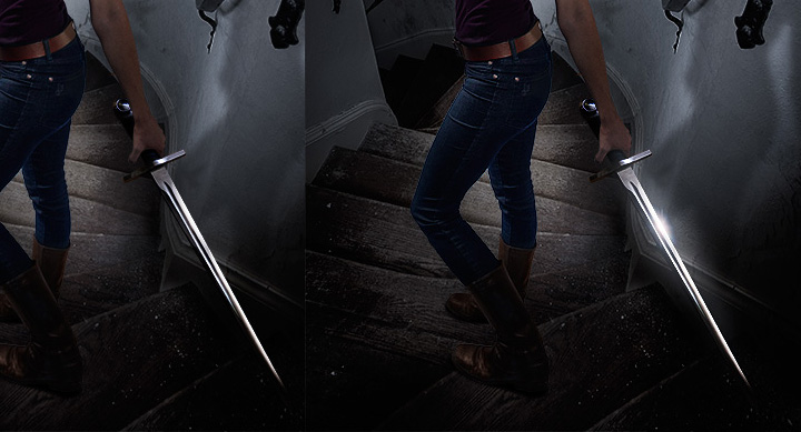
The next challenge of course, was the issue of the sword. I had a prop sword which I shot and masked out and placed into the scene, but it didn’t quite jibe. Rather it was fine, but it didn’t have enough pizazz or magic or something. So I gave it a bit of a glow and a little specular/spectrum?? highlight to bring more attention to it. Here’s the before/after:
Much better. The only thing left to do was to add a bit of vignetting to make Mary stand out and make the whole shot look more claustrophobic. I also added the grunge border I used on book one; yet another element of consistency between the two to give them continuity. Oh and last but not least istype/font, again I used the same style I developed for the first book. So, without further ado, the final cover for Underneath by Jes Young looks like this:

