What I Use

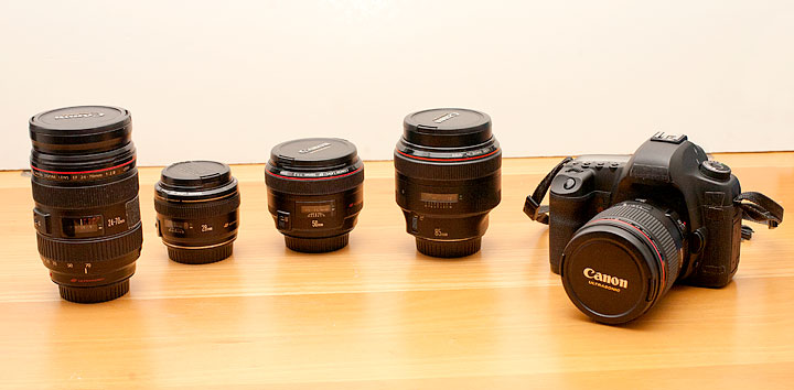
A lot of people ask me what gear I own and use. There’s nothing particularly special about my setup. I’m a pretty straight ahead Canon user with mostly nice L glass. All of the pictures I make could be made with similar stuff from other companies, but I figured I’d make a list anyway for those of you who don’t believe me and want what I’ve got.
Each link points to the product on Amazon. So if you plan on purchasing this stuff, please do it through my links so I can buy a can of Coca Cola. Thanks.
Digital
Canon 5D Mark III Body
Lenses
Canon 28mm f/1.8
Canon 35mm f/1.4L
Canon 50mm f/1.2L
Canon 50mm f/1.4
Canon 85mm f/1.2L
Canon 24-105 f/4L Zoom
Computer Gear
NEC 30″ Monitor with Spectraview Calibrator
Wacom Intuos Tablet
Apple 13″ Macbook Air
Kensington Expert Mouse
Western Digital Green 2TB Internal Hard Drives
Software
Adobe Photoshop CS5
Adobe Lightroom 4
Lights
5 in 1 Reflector/Diffuser
Canon 580 EX II Speedlite
Alien Bees B400
Alien Bees B800
White Lightning x3200
Profoto AcuteB Pack and Head
Photek Softighters – all 3 sizes
Avenger A420 Stand with D600 Boom
Film Cameras
Leica M4 with 50mm f/2 Summicron
Hasselblad 500cm
Cambo 45NX 4×5″ Large Format
Preferred Films
Kodak Portra 160, 400, 800 NC
Kodak E100 chome
Fuji Provia
Ilford 3200 b/w
‘365 Portraits’ Ed Dale Webinar
 A couple weeks ago I was interviewed by the ever illustrious Aussie Ed Dale for his private ‘Mentoring By Ed’ series. We spent about an hour talking about my 365 Portraits series from 2007. How the project came into being, similar projects I had done before, as well as some stories about specific shoots.
It was a lot of fun. The bad news is that you didn’t get to hear it. The good news is that Ed has given me permission to share them with my biggest fans (Shh, don’t tell the uncool people).
The SD (aka smaller) version http://media.mentoringbyed.com/MBE20110408SD_Webinar.mp4
as well as the HD (bigger) version http://media.mentoringbyed.com/MBE20110408HD_Webinar.mp4
Format Comparison Results

Last week my friend Dan came over with a couple of medium format cameras. (As a quick aside, Dan and I do a podcast called Circuitous Conversations with Bill & Dan if anyone is interested in that sort of thing) The idea was to take the same or very similar picture with a number of different cameras and formats in a controlled setting to see how much of a difference there actually is. Now I’m sure a number of other people have done similar comparisons over the years, but often they’re of some building outside or a still-life of random objects on a table. Pixel peeping porn for sure, but not really meaningful to me as a portrait photographer. To that end I asked my other friend Chris Keeting (yes, I only have two) to come and sit very still for a couple hours. Btw, Chris is @analognation on twitter is a painfully witty guy whom you should follow.
In the running were the following:
- a Canon 5D Mark II with a 50mm/1/2L prime at ISO 100
- a 1972 Hasselblad 500CM with 80mm lens loaded with Kodak Portra 160 film
- the same Haselblad 500CM with a Phase One P65 digital back at ISO 100
- a Phase One 645 body with 80mm lens and a different Phase One P65 back
- and for good measure, a Cambo 4×5 with 150mm lens loaded with Fuji 160S
The low-res results can be seen here: http://ontakingpictures.com/2011/02/format-comparison-teaser/
This is a surprisingly hard thing to do for a number of reasons. First is having the subject in the same position, and Chris did a wonderful job in this role. Though even subtle changes in the way the light hits his fact can effect how you perceive the images. Film speed is also very difficult. I wanted to get the light set and shoot them all with the same power of light at the same aperture. However if you look at the list above you’ll see that the film cameras were using ISO 160 film. Now, that’s only about a half a stop, and C41 negative film is fine with a little bit of over-exposure. So I let it slide. Plus, I was going to try to work a little curves action to get them in the same ballpark anyway.
Matching
It was also really hard to get the white balance of the pictures similar. To get the two MF backs to visually match the Canon at 5600K, they were at 5180 and 5860 respectively. I’m not sure if that’s a matter of terrible calibration at the factory or if that’s the way these things always act, but a 600k shift between samples, and neither was correct, is a alot. Somehow I trust my Canon more than the $40,000 backs on this respect. I also had to scan two different formulations of film and try to get them to match. Nulling out the orange cast of the film substrate in the process. Ideally what I should have done was to shoot a frame of a color chart which would give me a reference for everything plus neutral grays. But alas I didn’t think of it and therefore had to do it by eye.
The other big problem is that I was shooting at the same aperture, f/8, on all formats so that I didn’t have to reset the light value with every switch. The problem here is that f/8 gives a very different depth of field depending on the size of the sensor or film. Especially on the 4×5 where f/8 is just one stop away from wide open. In retrospect, I could have used a lightmeter to set the light lever for each camera while trying to compensate by stopping down the bigger cameras, but then you get into questions of diffraction effects of the lenses at that aperture and such. The practical upshot being that these are all different beasts and in some ways it’s like comparing apples and oranges. All those qualifiers out of the way, I do think I did a relatively good job of weighing and mediating all of the factors.
So what did I find out?
In the end, these are the points that I took away from looking at the resulting images.
First off, all of the cameras did a fine job taking the picture. All of them are professional quality. And if you’re only going to be looking at them on the web or your average magazine size print, there is no practical differences in my eyes.
You all know what 20MP full frame files look like, and I’m sure that many of you have shot film, so I don’t need to go into detail on those. The 4×5 looked suitably great. However I’d much rather use slide film or b/w in large format for some reason. In fact when it comes right down to it, I really only enjoyed shooting Polaroid 55 with it. That leaves us with the two MF backs.
 In the ‘pro’ side for the MF backs is the fact that there is a sick amount of information in the files. I’d say they have more in common with a 4×5 frame of film than a 120 frame. This also extrapolates down to smaller digital where I think my 5D2 gives me a file that’s almost as good as my Hasselblad using film. Definitely way more than my Leica can. The question then becomes “Do I need that much information?” and that’s a good question. Like I said, if you’re not printing big, then to my eyes there isn’t the need. Another thing is that because there is no AA filter in front of the sensor, you also get an incredibly sharp image as well. Like poke your eye out sharp and detailed. See below. MF RAW files are also 16bit (most modern SLRs are now 14bit) which means there’s more data in each color channel for you to work with. This results in extreme plasticity in manipulating the RAW data. Over-exposure of 3 full stops can be pulled back; similar results in pulling up the shadows, which are less grainy and quantized as well. You can do with with Canon and Nikon files, but not 3 stops in the highlights. Maybe 1, or 1.5 stops tops. This can be a lifesaver in very specific situations.
The ‘con’ side to all the above ‘pro’s is that your technique must be flawless. They are precision instruments and EVERYTHING you do is magnified. You get 3 times the data of my 5d, but camera shake and focus errors are magnified along with it. I found it very hard to focus accurately enough on both the Hasselblad (manual) and the Phase (auto/manual). The viewfinders, while huge compared to 35mm, are still no large or fine grained enough to match the sensor that’s ultimately catching the photons.

Speed is also a concern as these backs max out at about a frame a second. So if you’re used to snap snap snapping away at a clip, you’re in for a awakening. The autofocus is also slow and hard to control. Really there’s only the center point, which is fine for me since that’s all I usually use anyway, but if you’re trying to focus on the eyeball you may get the eyebrow instead half the time. I guess the answer here is to stop down the lens so that more stuff is in focus, but deep focus portraits are often not what I’m looking to take. Honestly, minus the backs, medium format cameras feel like 15 year old consumer film slr bodies. They’re also big and heavy. Not the kind of thing you’re going to want to be holding for hours.
Oh and I should mention computers for a second. Remember that these files are 3 times the size of the Canon’s. Which means they’re 3 times bigger when you open them up in Photoshop, which means you need at least 3 times the RAM to manipulate them at the same clip. I’ve got 12GB of RAM in my desktop and these images are HUGE. The picture of Chris that I posted the other day, with fairly light retouching and editing for me, came in at around 1.6GB as a PSD. If I were using one of these cameras everyday, I’d upgrade my RAM to 24GB or more without flinching. There were times when my desktop felt like a laptop while working on them, and I’ve got a very fast computer.
Finally there’s the question of cost. The Phase One setup was about ten times the cost of the Canon setup. Like in all things it’s certainly not a linear progression. The Phase is not 10 times better than the Canon. Maybe twice as good or three times as good in image quality, but only if you assume that everything else is perfect. The light, focus, tripod, etc. On top of the initial cost of the camera is the cost of the lenses which are often thousands of dollars each. More than the price of the Canon setup. Look, I’ve got a $8000 stereo, so I know the law of diminishing returns, but even I’ve got my limits.
Would I want one? Sure. Do I need one? No. And that’s actually a surprising result for me. I thought the results would make me speechless with awe, but in the end I was just really impressed. My next big gig where I’ve got a budget, I’ll certainly be renting one. A rig like that would have been great for some of my personal projects, but I can’t really complain as I’ve still got a setup that most people would kill for.
If you’ve got any questions, feel free to ask in the comments and I’ll try to answer as best I can.
NY Photogroup Salon
I’m one of 5 speakers tonight at the NY Photogroup Salon at SoHo Photo. Looks to be quite an eclectic grouping of work so I highly suggest you stop by if you’ve got the night free. $10 at the door, but I’ve heard that they’re well worth it. I’ll be sure to make your $2 for me worth your while.
|
||
|
Writing a Book, Need Input

I’ve spent the past 5 years or so reading and learning about photography on top of actually doing it. One of the things that drew me to it in the first place was that it’s both science and art. You could come at photography with light meters and calibrated tripod heads, or show up with a Holga and and mindlessly snap away with a hope that serendipity is riding shotgun. There are those extremes and everything in between which is why it’s so vibrant a culture.
Those who don’t know me might not now this but I love talking to people (hear this people who want me to give presentations, I’m waiting for your call) And I think I have a somewhat unique perspective on photography as an autodidact who wants to share and knows what he’s talking about. And not ‘what knob to turn when’ but rather ‘why do you turn THAT knob’. I’ve read countless tutorials, but most just teach you how to do it their way without explaining enough for you to make it your own. Well I’ve wanted to give back as of late and start helping other people.
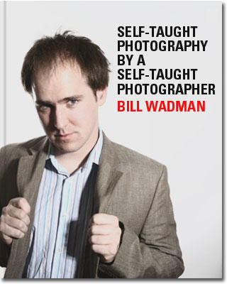
Therefore I’ve started to write a book, the working title of which is “self-taught photography by a self-taught photographer” (I know, it needs to be a little snappier and YES the fake cover to the left is meant to be a joke). In it I plan to pour everything I know about the craft and mechanics of photography. Hopefully in a way that people can understand and enjoy. So far I’ve only written around 10,000 words, but it’s a progressive thing. The point of this post is to make a list of what I’m talking about and making sure I’m not missing anything you’d like me to talk about. So here’s what I’ve got so far.
Camera basics and a quick history
-Sizes, types, and qualities of film
Exposure
-Shutter Speed and Aperture and ISO
Light
-Color temp and spectrum
-Available and artificial light (including the sun, speedlights, big strobes)
-Light modifiers
-Taking pictures with strobes
Deconstructing other people’s photos.
– shadow number and direction
– focal length and aperture
The anatomy of a digital file formats (pet peeve)
Digital Assets management
– computers and software
– flash cards and readers
– hard drives
– meta data
– folders and naming conventions.
– backup (online)
Buying a camera
– Specs that matter, specs that don’t. Manufacturer’s Voodoo.
Retouching Way Overcooked
Look I’m not going to lie, I do a lot of post production to my images and I think retouching has it’s place. Nowadays as a commercial photographer, you almost have to to make pictures look the way people expect them to look. We’ve become inundated with perfection in advertising and movies. And I’m ok with all of that. I know it’s an illusion and I expect that most other people do too. I expect it from cosmetic and beauty ads, or fashion shoots, but when TV and Movie actors start looking like plastic mannequins, you’ve gone too far.
Recently there was a poster for the Little Fockers movie with Ben Stiller and De Niro. Stiller is 45 and De Niro is almost 70, but on the poster, I swear to God, they looked 25 and 40 respectfully. It was retouching run amuck and you know the guys who work on movie posters are pros as well as my heroes so I’m going to give them the benefit of the doubt and blame it on their clients. This was totally some exec or producer who kept coming in and saying, “You’ve got to make them look younger” and the retoucher said, “But sir, it’s going to start looking really stupid soon because it looks a little stupid already”. But of course the money talks and you end up not with a couple of good looking hollywood men with some make-up on and their skin cleaned up for zits, but rather something much close to a photo illustration than a photograph.
Here’s another one.

Look at Kevin James’ neck, and don’t get me started on either of their foreheads. Are these guys supposed to be in college? You know they don’t look like this in the movie, so why not make them look like well groomed actors, which I’m sure they are. Do a little work to clean it up, but don’t sandblast them.
Speaking of sandblasting, take a look at this poster for the new season of White Collar.

I watch this show, so I know what this guy really looks like. And you know what? He’s one of the better looking people I’ve ever seen. He doesn’t need the help guys, and he certainly doesn’t need to look like this. This is such awful retouching that it’s a bit embarrassing. Back when you don’t know what you’re doing so you just create a new layer, blur the shit out of it and then paint it in with a mask, THAT is what this looks like. It looks like what I would do if I only had 15 seconds before the bomb went off. I hope that I speak for all of us when I say that we’d much rather see the real person.
I guess the main point is that ideally, pictures shouldn’t LOOK like they’ve been retouched. The best people’s work, and the goal that I aspire to, doesn’t look like it was touched at all. I’m ok with idealizing reality in photographs. Just don’t make it look unreal or it looks incredibly stupid. The pendulum as swung way too far in the other direction and the people who make decisions really need to know when to stop because they’re overcooking stuff way too much. Ok rant over, you can all go back to your lives. Thanks.
Heather
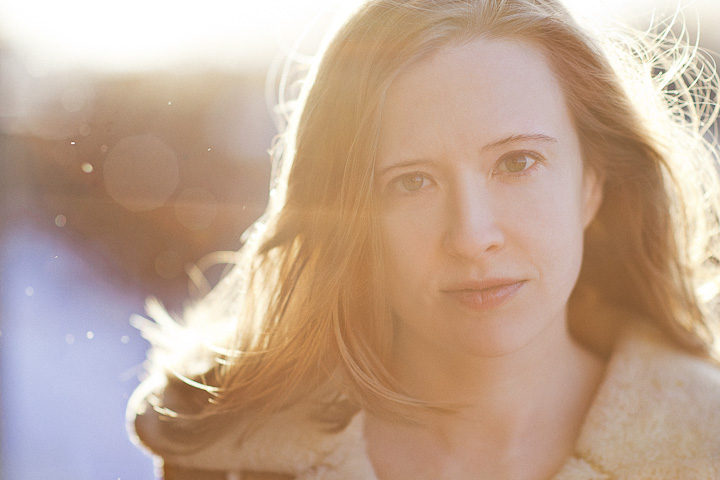
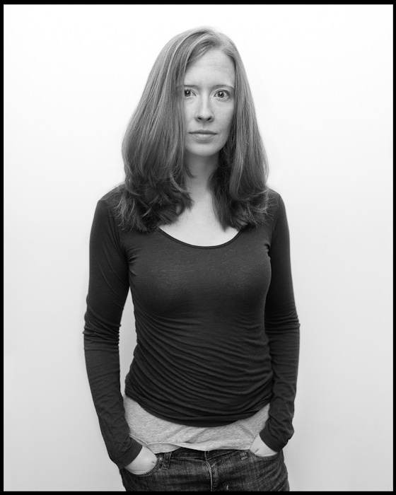
A quick pic of Heather on our anniversary.

My day involved in goodness: (RED) 2015 poster
So a few weeks ago I was asked to participate in project to create a poster for the (RED) campaign against AIDS. Well mostly I watched designers Craig Ward and Ian Wright create the 4×8 foot poster out of raffia fibers and rope. It’s always fun to watch masters at work. Though it took several hours to create, in the end it was my turn to take a few minutes to photograph it. They had worked with tan rope on black board and then did a little wizardry to flip it to red rope on white for the final poster.
The entire campaign is launching today and they’ve posted the images on the (RED) blog, so I figure it’s time to give you a peak. You can check out the final as well as the posters from the other designers here:
http://blog.joinred.com/2010/11/aids-free-generation-is-due-in-2015.html
Here’s a portrait of the gents with their creation:

Heather

The Making of Drabbles – Video Lecture
Some of you may remember that I gave a lecture on the making of my Drabbles portrait series about a month ago. Well my good friends Dan and Claude used their nerdy might and recorded it for your viewing pleasure. It was, as you would expect, quite dark in the room, but I’ve gone in and inserted full screen images of what was on the screen for your viewing pleasure.
About 45 minutes of photoshop post-production and compositing goodness. If you ever wanted to know how I pulled a lot of them off, this is your chance to find out.
I could embed it here in a smaller size, but go over to vimeo and watch it at full-size instead.
I hope you enjoy, and please spread it around.

