Ivy Bridge Hackintosh Update
 So here we are about a month after I first wrote about building a new Hackintosh workstation based upon Intel’s new Ivy Bridge CPU and Z77 chipset. Well the motherboards and CPUs have now been released and I’m ordering the rest of my parts today so I thought I’d give you an update.
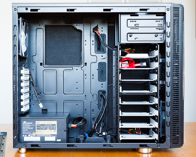
Up til now I’ve purcharsed the Fractal Design R3 case, 32GB of Mushkin Black RAM, a 240GB Intel 520 SSD, and a 750W Seasonic Power Supply. And here to the left what that looks like without the important parts. Not all that exciting, but pretty sexy, right? Those are 8 sleds over on the right there for hard drives. Yum. Basically it’s sitting there waiting for the real brains.
I’m not going to go through every detail again, just the stuff that’s changed since the last writing, so go back and check that post out to get up to speed.
CPU – Intel 3770K
As I had planned, I’m ordering the top-of-the-line unlocked CPU so I can do a little overclocking. So far is seems like the reviews are good but not amazing. Mostly due to the fact that it doesn’t seem like people can overclock Ivy Bridge quite as much as the last generation Sandy Bridge. People are not sure exactly as to why. Whether it has to do with the smaller die being a smaller area to try to pull heat from, or the new 3D transistors not being able to dissipate the heat, I’m not sure. The conclusion seems to be that you should clock it as high as possible on stock voltage, but don’t bother trying to push higher by giving it more juice. That said, since you get about a 10% boost in performance at the same clock speed due to improvements they’ve made to the logic, I’m ok if I only get to 4.5GHz (which feels a little crazy just to type). Either way, it’ll be a nice jump up from my 3.2GHz overclocked i7-920.
Motherboard – Gigabyte GA-Z77X-UD5H
I know, long name right? Well Gigabyte motherboards have always been a favorite for the Hackintosh community. They’re well-built relatively inexpensive boards which tend to be easier for the nerd-kings to make work with Mac OS. This is their current top-of-the-line model but without the built in bluetooth and wifi which I don’t need. Better power systems that the lesser boards, and with built-in Firewire 400 I need for my external M-audio interface and Intel gigabit ethernet. Also, extra SATA ports for more hard drives and more USB3 connections. The only thing it doesn’t have feature-wise is Thunderbolt. Apparently boards with built in Thunderbolt are coming next month, but I’m impatient, and honestly I don’t know that I need it right now. I use a DVI based display and prefer internal storage as a general rule. And if I need external, USB3 is plenty fast that a single drive can’t saturate it and a hard drive dock costs $30 instead of $300.
Perhaps the best part about the new Gigabyte motherboards is that it seems that they’re compatible with Mac OS power management out of the box. Which means no need for a DSDT file or anything. Sleep and Wake and Speedstep just work. Which is very exciting. That’s the one thing my currently Asus based machine doesn’t do well. I tend to shutdown at night and restart in the morning. It would be nice to be able to reliably put the machine to sleep.
Video – Zotac GT440 1GB
So it turns out that my genius plan of using the onboard Intel 4000 video was a fools errand. Both because the performance is pretty ‘eh’ and also that the DVI output on most of the Z77 motherboards are not Dual-Link which means they can’t push the full resolution of my 30″ NEC display. There are adapters that will do it but they cost about $100, which is more than a nice upgraded GPU would be. So in the end I’m ordering a discreet GPU to go with the new machine. I can’t stand the fan on the Gigabyte 5770 I’ve got now, so I’m grabbing the fastest fanless card for under $100 bucks. Which at the moment is the Zotac Nvidia Gt 440 with a gig of RAM. Should be fine for my purposes and dead quiet which is the goal.
Storage
The only other place I’ve had thoughts is on the main spinning hard drive storage. I mentioned last time that I was considering finding a RAID-5 card and using 3 drives as my main array. I’ve heard some horror stories and have yet to find an economical solution, so I think what I’m going to do is create a software RAID-0 across a couple of drives and have automated backups run every few hours in the background so I don’t lose everything in case on of the drives goes down. That should give me a pretty immediate doubling of disk performance while loading and saving images. Still cooking on this one. If anyone has any advice, I’m all ears.
———
I think that’s about it for now. More to come in a few days when I start to build this thing.
Announcing the Bill Wadman Portrait Workshop Series
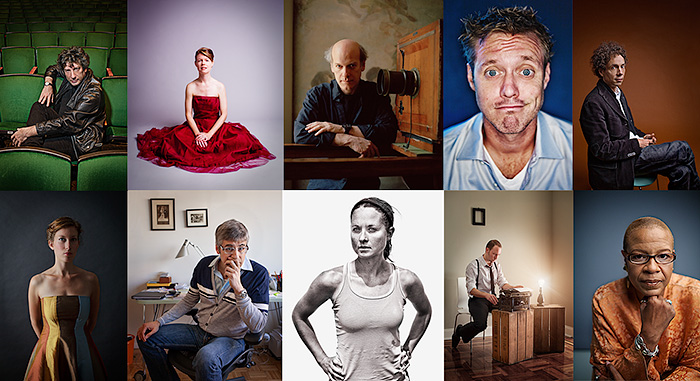
I admit it. I love sharing what I know with people. In fact, that’s what most of the writing on this blog is about. But there’s something about teaching people in person which totally trounces writing, so I’m going to do what I’ve been meaning to do for years now.
I’m announcing a series of workshops here in New York City in which I’ll going to explain how I make portraits. One every couple of months is the plan. Since it’s a lot of information, we’re going to start at the beginning with the first workshop with ‘Light’. I’ll talk about controlling available light, how I use speedlights, studio strobes & modifiers, how to get the best out of your subject, lens selection, and more. You’ll have questions, I’ll have answers.
Saturday May 12th is going to be the date, and we’ll work together for 4 hours from 1PM to 5PM in the afternoon. I’ll have an attractive model of some persuasion for you to work with, and we’ll spend some time critiquing each other’s results so that all of us can walk away better photographers.
Total Workshop Fee for ‘Light’: $250 + $50 model fee
If you’re interested and would like to register, all I need right now is a $125 non-refundable deposit to save your spot.
Click below to be taken to the Paypal site to snag a seat for what I hope is going to be a great and knowledge packed afternoon.
Also, since this is the first one, I’m going to limit it to a fairly small number of participants so don’t wait too long to sign-up!
In subsequent workshops I plan to cover conceptual compositing, digital workflow, and retouching.
Don’t panic this is just the beginning. Very exciting!
Building My New Ivy Bridge Hackintosh Workstation
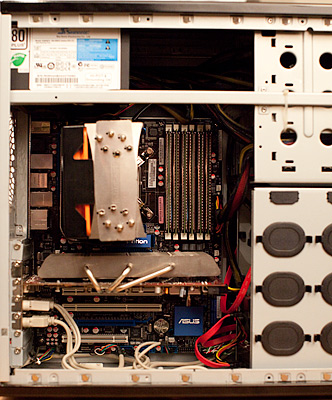 While I’m writing this sitting on my couch with a Macbook Air, when I really need to get work done I do so at my desktop computer. Old school towers are still great as a photographer’s workstation and there are reasons for that. You can use the best and fastest components, they’re easily upgradable, they can fit more storage, and for me, they’re fun to build.
As many of you who read my blog may already know, I use a Hackintosh as my main desktop. Have so for about a year now. For the uninitiated, a Hackintosh means that I’m running Mac OS X on a computer that’s not built by Apple. Some people install it on Dell and HP machines, but in this case the computer was build by me from parts about 3 years ago. At first the OS X thing was an experiment but I’m going to stick with it.
My current i7-920 machine is still relatively fast, it’s got 24GB of RAM and 6+TB of drives, but it’s now 3 years old and I’ve been itching to upgrade. To that end I’ve started putting together the pieces I need to build my new machine and thought I might document the process. The main catalyst is the upcoming release of the new Intel ‘Ivy Bridge’ chips which should happen in the next few weeks. So while I’ve got most of it planned out, there are still a few grey areas to fill in as I go.
There are a few things about my current machine that I’d like to address in the process of building the new one. First, I can’t stand the noise from the fan on the video card. I’m a pretty serious stickler for quiet computers, and the rest of the fans in my machine were bought with that in mind, but the Gigabyte 5770 ‘Batmobile’ card I’m using spins up far too often. And since I never game and really only use Lightroom, Photoshop, and Chrome with any regularity, I don’t really think I need a fast card, so I’m going to try to go without. Also, while I’ve got plenty of storage which I back-up nightly, I’d really love to speed it all up and simply my drive layout, so I’m looking into running 3 drives in a RAID 5 array as my main storage.
So here’s my planned parts list so far:
CPU ~$330
Intel i7-3770k
Top of the line consumer processor. Quad core @ 3.5GHz stock, but it’s unlocked which means it’s begging to be over clocked. I’m going to try to get mine to 4.5GHz with some aftermarket air cooling. I’d love 6 core, but for the work I do I don’t think I’d get enough of an advantage to justify the cost increase.
Motherboard
No idea as of yet since none have really been announced. For some reason, Gigabyte brand motherboards have become the most well supported in the Hackintosh world, so I’m leaning towards those for now. I’d love to have Thunderbolt built in, and there are a few manufacturers who have announced it as a feature. All Thunderbolt controller chips are from Intel right now, so whatever they’re using SHOULD be compatible with OS X without too much work. The new boards will have USB3 anyway which should be plenty fast enough for backups using bare drives in one of those hard drive docks.
One big motherboard question is if I can get away with using a Micro ATX sized board instead of a full size ATX. I don’t need the extra slots, and would love to shrink the size of the case I need in the process. The motherboard is the biggest hole in my plan right now.
Video Card
None
Well not none, but my plan it to try and use the new Intel HD4000 graphics which are built into the 3770K CPU as my graphics card. Based upon everything I’ve heard, it should be plenty fast for what I need it for which is almost entirely 2D work. Photoshop CS6 relies on OpenGL much more leveraging the same graphics subsystem as Premiere, but I still think I might be able to get away with this latest on-board graphics. Cost is a great advantage, as is the lack of additional fans to cool another card, which solves one of the problems I have with my current rig.
Worst case scenario, I’ll get a lower-end nVidia passively cooled card like a GT430. Let’s see if we can do without it though, shall we?
RAM ~$250
32GB DDR3 in 4x 8GB DIMM
I’m planning to put 32GB of RAM in there. An upgrade from the 24GB I’m using now, and a no brainer for Photoshop use especially since RAM is pretty cheap at the moment.
Boot Drive
Intel 520 240GB SSD
This one I already bought last week because it was on sale. I went with the new 240GB model Intel 520 SSD. It wasn’t cheap, a bit over $300, but it’s gotten great reviews and it’s crazy fast. My current machine uses an 80GB Intel G2 SSD from a couple of years ago and I’ve had zero problems with it. Which is something I can say of almost every Intel product I’ve ever bought. They do reliability right.
Storage
4 or 6GB RAID-5 Array
So I currently use a pair of 2TB Western Digital Green drives which I backup nightly to sparse images on a 3TB Hitachi drive using Superduper! I’ve also got an additional 2TB ‘media’ drive which I use to store music and movies and software downloads and such. I back this one up every once in a while but it’s not vitally important stuff.
What I’d love to do is take 3 of the 2TB WD drives and create a RAID 5 array. This would have the benefits of having just one photo drive I have to keep track of, a big speed boost because of the striping data among the drives and a certain amount of data security due to the redundancy of RAID 5. I’ve looked into a RocketRAID card to do this for me as I want to use hardware RAID, but I haven’t come down to a best fit yet. Advice on this matter is appreciated.
The one downside to a big array like that is that my backups might be a bit more of a pain in the neck as I’ll need another array or a single big 4TB drive to backup to and those aren’t cheap right now. In fact hard drives in general aren’t cheap right now due to the floods in Thailand last year, but they’re getting better.
Power Supply ~$120
Seasonic X750 750W
I’m a fan of Seasonic power supplies. They’re built like tanks, and they’re quiet and they’ve never let me down. I saw a great deal on this power supply last week so I snapped it up. Best part about this model is the fact that at under a 20% load, the fan doesn’t turn on at all. So it’s crazy quiet. It’s also got modular cables, so you only plug in the ones you need. No more extra cables to hide away. Looking forward to trying it out.
Case ~$120
Fractal Design Define Mini
If I can pull off the MicroATX motherboard, this is the case I’m going with. If I can’t I’ll get it’s big brother. Either way, I’ve heard great things about it. Resonance dampened panels and rubber dampened sleds for 6 hard drives. More than enough for my plans.
———–
So that’s what I’ve got so far. Hopefully Intel will announce the new chips in a week or two and we can get on with the fun of building this thing out.
Any suggestions or advice on the selections above are appreciated if you want to leave a comment.
More to come…
Canon 5D Mark III Hands-On
I’m still in the process of updating this post as I play and have a chance to write my experiences.
So beware, it’s alive!
About an hour ago, Fed-Ex dropped off my new Canon 5D Mark III which I pre-ordered a couple weeks ago from OneCall out in Spokane, WA (They’re not a sponsor, but I’ve found them a great place to buy stuff).
I’ve got my new camera ritual which involves covering all of the Canon markings with tape while the battery is fully charging. And since that’s happening right now, I thought I’d start with the tactile stuff. I have since updated the post with more observations and a few corrections.
Build
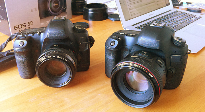
First off, the Mark II felt a lot like the original 5D. This new camera does not to me. Others have mentioned this, but I’d like to concur that it feels much closer to a 1D body than old ones ever did. Like a 1D without the portrait grip buttons. Overall it’s a bit heavier, a bit thicker front to back, so that the grip is better for bigger hands like mine. The prism bump is also bigger, to fit the new 100% viewfinder (finally!). I personally want a camera that’s a little bigger in the hands, with a little more heft to keep things steady, so these are all good points in my book. The bigger size also makes it feel like front heavy with big lenses like the f/1.2 primes.
I can’t comment on environmental sealing, but if the feel of the build quality is an indication, I’d assume it’s improved as well. Then again, that was not really a problem for me with the old cameras either.
Controls
A few changes on the controls as well. First is that the mode dial requires you to push the center down to turn, thus locking it from changing in your bag or against your side as your carry it over your shoulder. There’s a dedicated still/movie switch instead of relying on the little live-view button as on the old one. Apparently there is a rating button so that you can give star ratings in camera. This sounds great as long as it’s all using the same metadata slot so that they show up starred in Lightroom when I import (Update: The ratings do successfully transfer to Lightroom).
As well as the rating button, there’s a new Zoom button. On the Mark II you used the focus select button and the one next to it to zoom in and out of the current image on the review screen. It involved a lot of tap-tap-tapping of buttons, but I was used to it. Now you press the zoom button with your left hand and roll the dial up by the shutter to zoom in/out. Something new to get used to. And it looks like you can now zoom all the way in to 100%. On the old camera preview was limited to the resolution of the small preview jpeg. The only thing I don’t like about that so far is that when you’re zooming back out it goes past the current full image and all the way out to a thumbnail view of all your images. So you can’t just blindly zip the dial to get back to fit. There should be a setting for that somewhere.
And speaking of controls this is as good a place as any to mention the screen, which is pretty nice. Now wider than the last one and truly 3:2 so that images fill the screen. Looks bright and accurate. Nothing bad to say here, other than to mention how far we’ve come with the screens on the back of cameras. Remember when they were 1.8″ and 320×240? Me too. Wow.
Viewfinder
The new viewfinder is bright and big. A bit bigger than the Mark II, and the focusing screen they used is much more matte than in the old camera and a tad darker. This is good news for me because I like to be able to see the lens’ depth of field. We’ll see how it works in practice.
Another interesting thing is that there are no markings in the viewfinder without power. It’s all a EVF kind of thing. I hear there are settings to show/hide the AF points and exposure data from the bottom as well (Update: I can’t find a way to turn the exposure data off, though I’d love to). That all sounds delightful to me. Makes it feel like you’re shooting with an old analog camera. Less visual clutter.
One weird thing I’ve noticed is that if I have no battery in the camera and just manually focus the lens, it’s completely off. Infinity is focused about 6ft away and all the way in is almost macro, and that’s on a lens that normally can’t focus below 24″ or so. I thought something was wrong with the camera (and perhaps there is), so much so that I grabbed the battery off the charger, but the instant I hit the focus button, everything worked fine. Weird and curious.
Shutter
The Mark III shoots like 14,000 frames per second. Ok, actually only 6, but even that is about double the Mark II. I rarely shoot anything but single shot anyways so this isn’t cool beans to me. However it does me that they had to improve the shutter system a bunch in order for it to move that fast and handle that many actuations. The practical upshot of this for me is that the shutter black-out, which is the time where the viewfinder goes black while the mirror pops up and exposes the sensor, is now almost nonexistent, which is amazing to me. It’s one of the big things I missed moving from the 1Ds to the 5DII, so I’m back in nirvana.
The new shutter also sounds great. I know it’s a fetishy kind of thing, but it matters. Makes the whole package feel more responsive. Like when you put an SSD in your computer for the first time and now every computer without one feels broken.
In addition, Canon has added silent shutter mode. We’re talking very quiet, as in Leica quiet. It adds to the shutter lag a bit, but I think it could be useful if you’ve got to take picture during a performance, interview, or video shoot.
The Files
Let’s talk turkey, because all the rest of that isn’t worth a hill of beans unless the images look good. I’m not going to do a side-by-side comparison of the Mark II and III. There are plenty of sites out there who will do that kind of anal testing. For me it’s whether the sensor does a good job of capturing the image I focus onto it, and if the RAW files are malleable. That is, if they can be manipulated well. Shadows pulled up without a lot of noise, blown-out highlights retrieved and that kind of thing.
To that end I went up to Prospect Park around dusk last night and took some artistically terrible pictures with my 35mm/1.4L lens. Their saving grace is that they’re good tests of some of the extremes of what I’m talking about and therefore, perfect for our purposes.
The main workflow problem I’ve encountered is that Lightroom does not yet support the 5D Mark III’s .cr2 RAW files. Seriously camera company people, just start writing them to card as DNG, everyone will be better off. Anyhow, I found a release candidate of the next Adobe Camera Raw plugin and converter, which I used to convert them to DNGs which I then brought into Lightroom. I’m sure this will be fixed with an update within the next few days, but in the meantime, there is a way around it folks and that’s the system I used for the examples below.
By the way, I tried the supplied Canon DPP software before finding the converter and I will spare you how frustrating I found using it. Honestly, if that were the only RAW conversion option, I’d shoot JPEG. OK, enough with the rant, back to the results.
First is a shot of a barren tree silhouetted against the sky. ISO 400 at f/6 1/160th of a second. Again, not a good photograph, but a good test of high-contrast detail. And it’s plenty sharp to me. Minimal processing, I turned on lens and CA corrections in Lightroom, opened up the shadows a bit (which they did nicely) and used default sharpening which is pretty conservative. Sharp all the way to the edges. This is why I shoot with high-end prime lenses by the way. Click here to load the full res image into a new browser window and you can see for yourself.
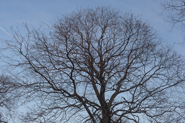
Here’s what the branches at the very top of the tree look like at 100%. Ya, that’ll do.

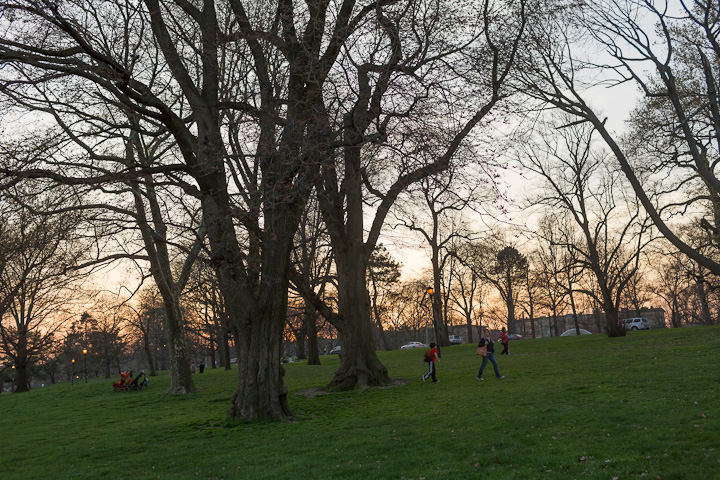
Next up is a very high-contrast backlit shot. Again, terrible photograph, but good for our purposes. Also iso 400 with blocked up shadows and blown out highlights. Good test of malleability.
Here’s how it looked on import:
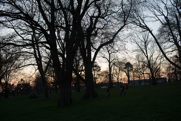
After a bit of opening up shadows and pulling back highlights:
A small chunk of it. A little shadow noise, but that’s without any noise reduction and I did a fair amount of digging in those shadows.
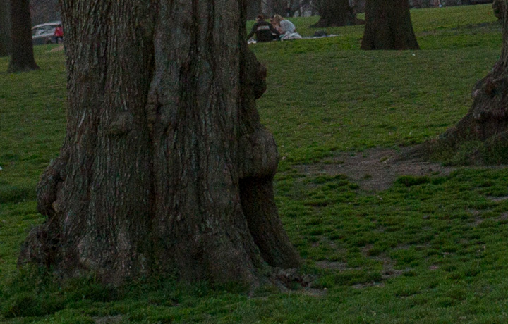
Overall I’m quite pleased. Plan to take it out with me today to take some real pictures. More to come.
So Close
There are a few things Canon got SO close on, but missed in the end. They added a ratio crop mode, so that you could for example shoot square or 4×5. However the crop lines don’t show up in the viewfinder, but rather only when you’re using Live View, which rarely if ever interests me. I use an SLR because I like a viewfinder, thank you very much. Nikon has had this for a while and I was excited when I saw it on the spec sheet, but they let me down.
I also wish they had moved the diopter control deeper under the eye cup. I’ve already changed it inadvertently. To the point where I’ve gone and used a bit of gaff under the eye cup to keep it in place. Seems to be a decent if hack solution.
—-
If you’re thinking about ordering one from Amazon. You can use this link and help support the site at the same time.
Canon EOS 5D Mark III 22.3 MP Full Frame CMOS with 1080p Full-HD Video Mode Digital SLR Camera (Body)
Oh and my Mark II is now officially for sale if anyone in New York City is interested. I’m looking for $1750 cash.
Adobe Lightroom 4 Beta – Initial Thoughts
Yesterday Adobe announced the availablity of a beta version of Lightroom 4, the next version in it’s line of photo cataloging and RAW conversion software. As daily user of Lightroom, a new version is always something fun to mess around with.
First things first, this is beta 1 people, which means that it installs separate from earlier versions of Lightroom and uses it’s own library. Don’t be an idiot and go messing around with your real data here, it’s too early for that. Duplicate some raw files and import them to play with. I for one have only installed it on the Air to play around. You have been warned.
Ok, so new features I like:
The Develop Module has been moved around a bit and has a new 2012 engine underneath. Gone is the ‘brightness’ slider which I never used much anyway and they’ve added new ‘Whites’ and ‘Blacks’ sliders which lets you move the white and black points respectively. These two along with the remaining ‘Highlights’ and ‘Shadows’ sliders giving you finer control over the bottom and top end of the luminance range. You end up being able to control the curve at both ends better. More like a parametric EQ for pictures. Very cool.
They’ve also added a few options to the adjustment brush tool. Now you can paint in noise reduction, moire removal, mess with local shadows and highlights. And perhaps my favorite of the bunch, local color temp and tint. So when you’ve had to shoot in mixed lighting for some reason and need to have part of the picture as tungsten and another as daylight for instance. The only thing I don’t like about it is that it’s a relative thing, so paint in +/- 100 temp instead of having it be a normal kelvin scale. Very neat idea though and something I’ve wished for before.
They’ve also added per channel curves adjustments for color correction adn such. Basically, you can do more of your work in Lightroom before or without taking it into Photoshop.
There are new additions to the DNG spec too, including a new lossy compression option. Almost all of the advantages of RAW while using much less disk space. They suggest it for outtakes that you want to keep around but don’t need to be obsessive about. You can also now lower the resolution of a RAW file without losing the ability to mess with the data later. Another way to save space.
Another neat addition is the ability to email a file straight from Lightroom without having to export it and then attach it in gmail or whatever. Soft-proofing in the Print module has also been added, I tend to get good results from stock profiles and a well calibrated monitor, but I’m sure some people will be quite happy with that one.
Oh and the video features are huge. Playing video for one, and having the ability to use most of the Develop module controls on them. Setting in and out points, etc. I don’t mess with video much and if I did, I’d be doing it in Premiere or FCP, so I’m not sure how useful this stuff actually is.
All that stuff is super, now the additions which made me groan:
There’s a new Maps module which will grab GPS data from your pictures and let you find photos by location. This is obviously a cool use of the metadata for people with tagged photos, but most cameras don’t have GPS, so now there’s a whole new module up top that I will never use just like the current Web module. If you’re going to keep adding these Adobe, have some check boxes in the preferences to turn them off.
Another new module is Books, which lets you layout and upload a Blurb book straight from Lightroom. This is also very neat and I wish I had it when I made the 365 Portraits book a few years ago, but alas. Some people are complaining that it’s only Blurb. I’m sure Adobe made a deal and in my experience it’s a good choice. Blurb does a pretty good job all things considered. Also a module I wouldn’t mind having the ability to turn off most of the time.
Oh and one omission which has been driving me nuts lately. Many of my .psd (PhotoShopDocument) files end up getting too big, especially with the no flate plugin, over the max of 2GB so I have to save them as .psb (PhotoShopBig) format. However, despite the fact that .psb is an adobe creation Lightroom doesn’t see them so they don’t show up in the library. I just have to remember “Oh, I had to make this a .psb, I guess I have to go find it in Finder). Annoying. I’ve put a post on the beta forums but no answer yet.
So there you have it, I’m sure there’s more in there I haven’t discovered yet. Good start so far. The interface is a little buggy right now, a number of times I’ve had to click a pic a few times before it shows up in the main Develop window for instance, but I’m sure they’re on it. Let me know what you think below.
Setup Notes on the December Portraits (Part 3 of 3)
Part 3 of the ‘behind the scenes’ notes from my December Portrait series. Here are parts One and Two if you missed them.
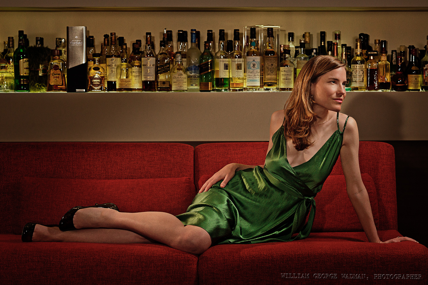
21: Minx
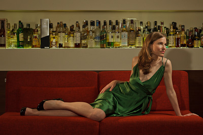
Pretty basic setup. Three speedlights. One up and to the right of Charity as something like a key light. Another slightly behind to her left and the last next to the camera for fill. Overall not too difficult to shoot a pretty lady lounging on a couch. Slight crop and light shaping in post.
22: Birthday
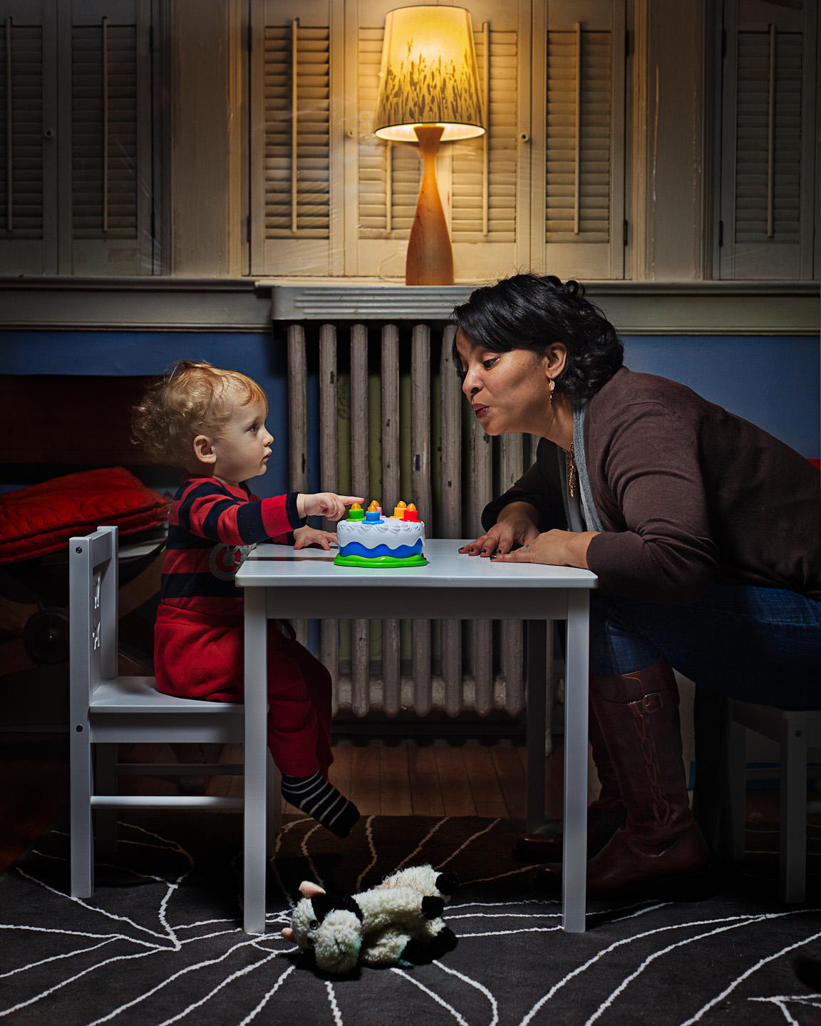
One of my favorite in the series. My friend Kecia on the evening of her birthday sitting and blowing out candles on a toy birthday cake with my adorable nephew Bert. Not the kind of thing you can make an 18 month old do. Luckily he was interested enough to sit down and play with Kecia for the 30 seconds it took to get the shot. Composited together a shot of him and one of her in the end.
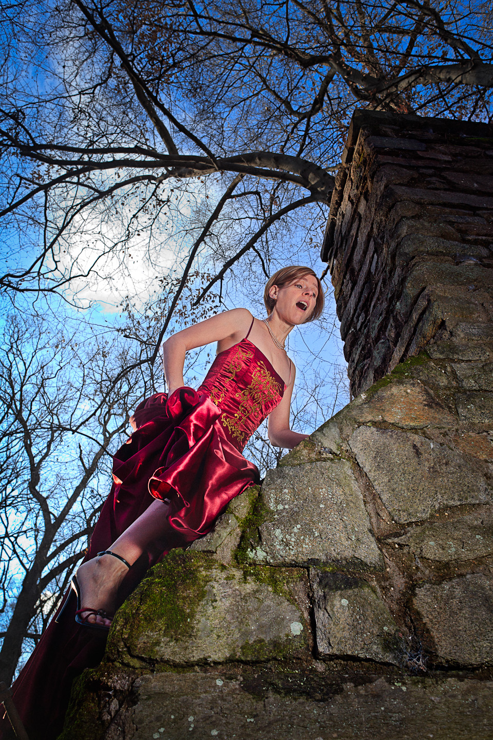
23: Escape
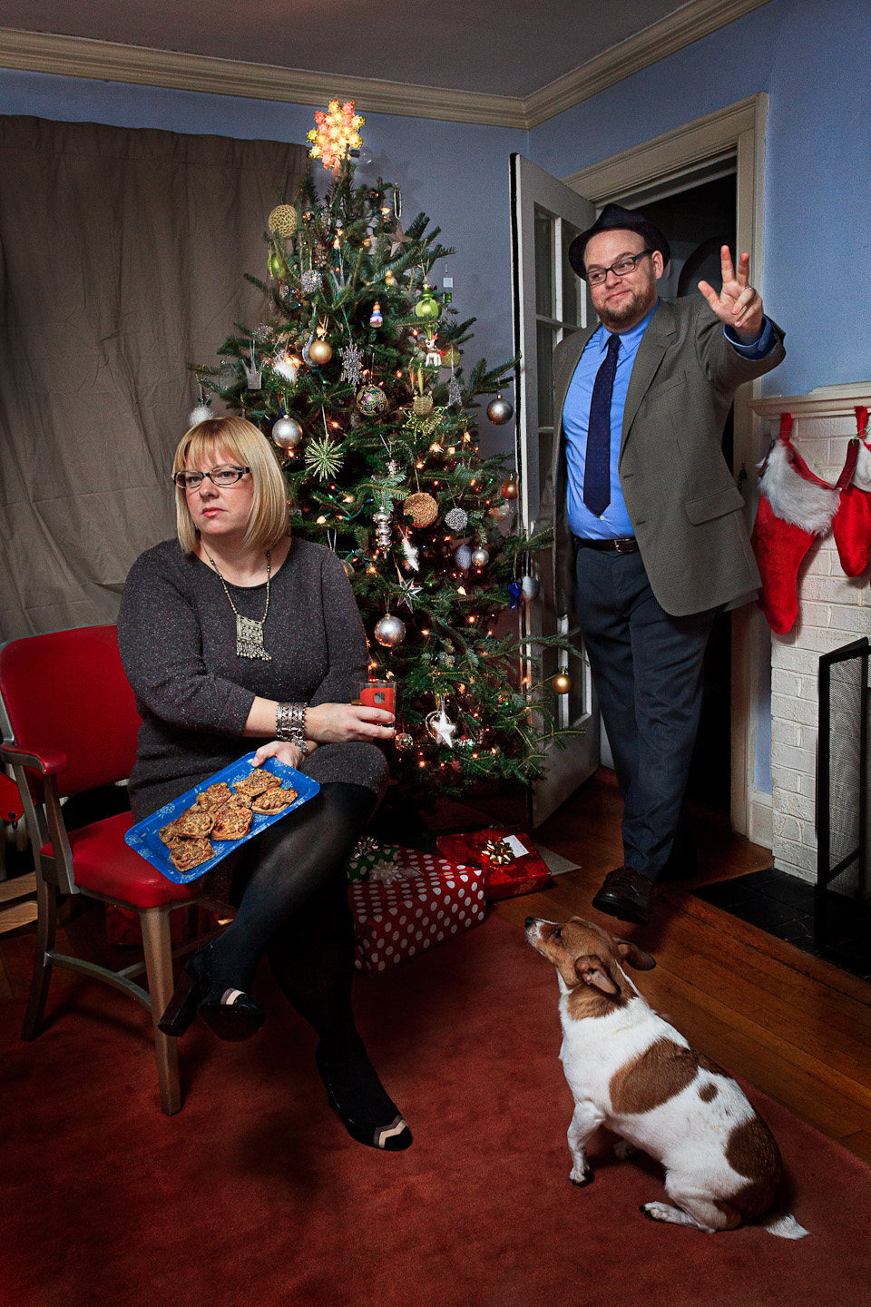
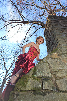
24: Late
As I was down with my family for the holidays in DC, I had a couple volunteers to help me out while I was down there including Adrianne. Who climbed up the chimney of an abandoned picnic house in the woods down the trail of a park near her house. Felt very fairy tale so I thought it would be fun to have her trying to escape her captors and then climbing too high. One speedlight through a diffuser as I recall, camera left aiming up.
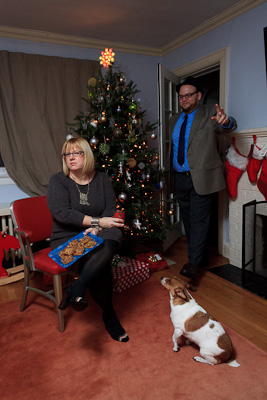
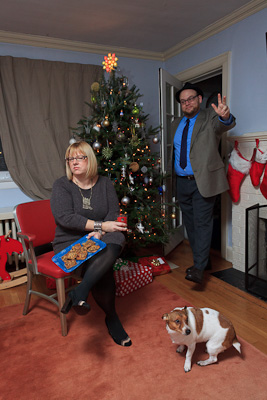
My sister and her husband Kevin, who you might remember as the crazy man with the knife in the shot from December 2nd. Since it was Christmas Eve and their 2nd wedding anniversary, I cast them as the wife waiting for her husband who’s late for the party. One speedlight through an umbrella. Composite of two shots to get the expressions right.
25: Together
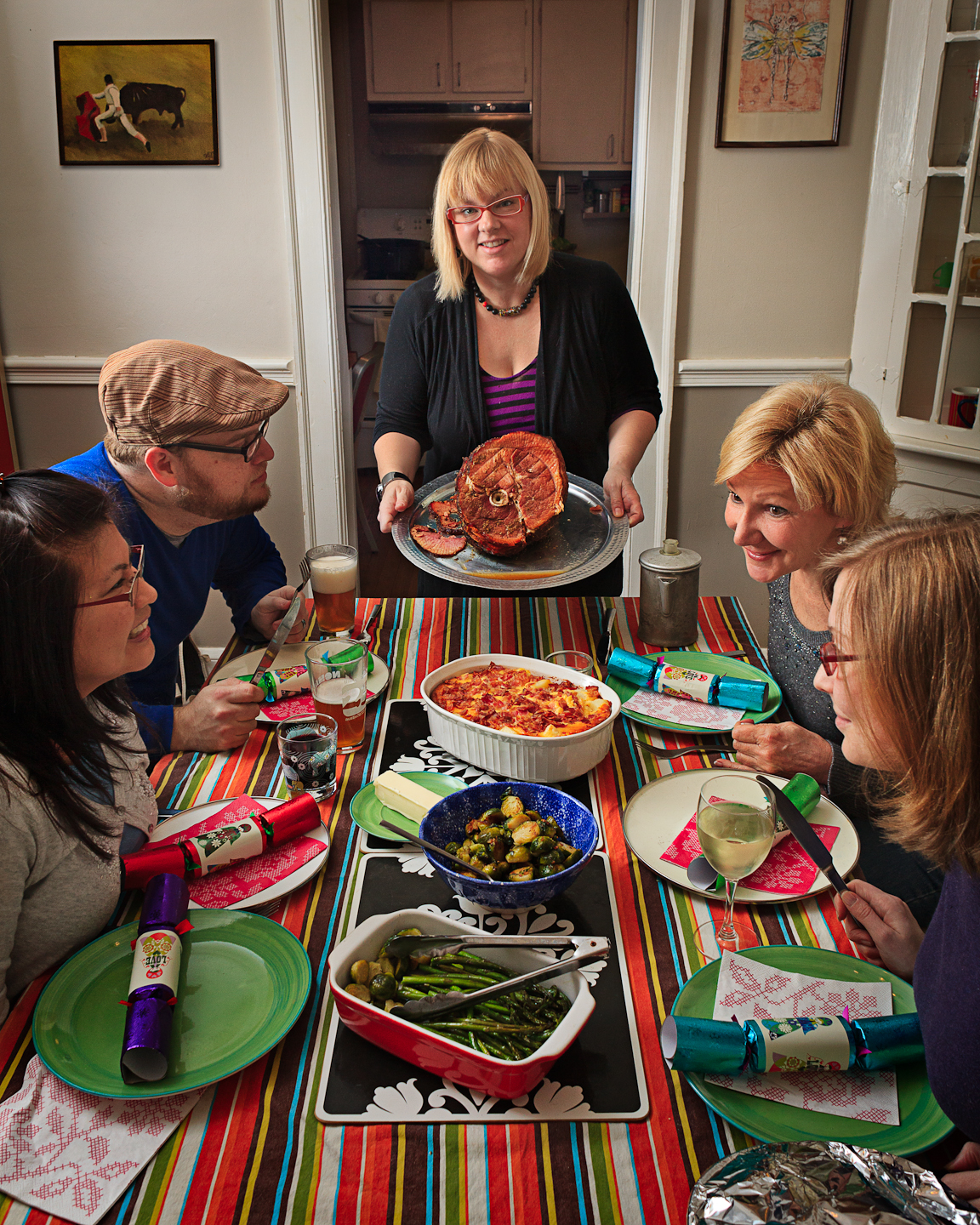
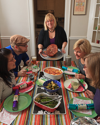
Christmas Day. Perfect time to do an homage to the Rockwell painting of the family at the table. It was dark out by the time we ate though, so light is from a speedlight bouncing off the wall camera left to mimic window light.
26: Espionage
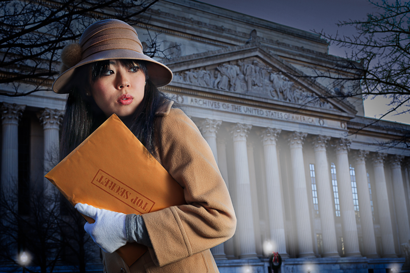
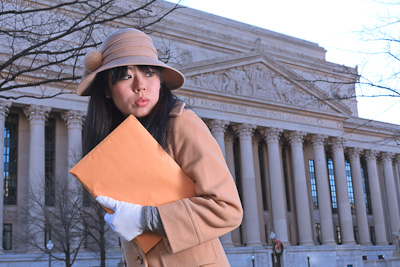
Youri is a friend of mine from NYC who’s family lives in northern VA, so we met up in town and shot her as a spy stealing from the national archives. It’s got a distinctly Boris and Natasha feel, but it was fun. Shot in the daytime with a speedlight through a diffuser to the right. A bit of post to darken the whole thing and make it look more like a headlight on her as well as turn on the streetlights.
27: Wrestle
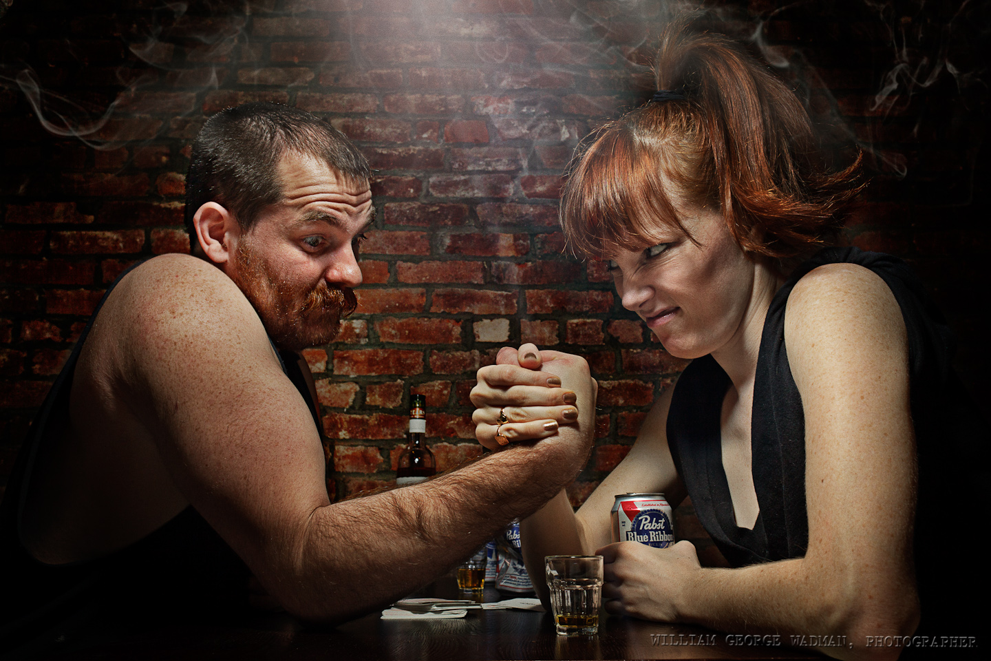
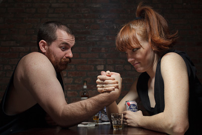
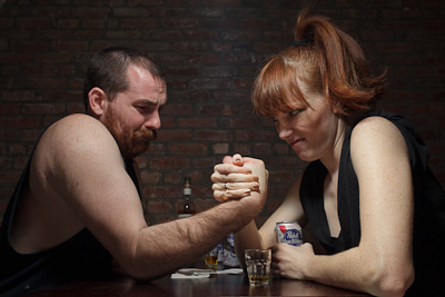
My little redhead friend Mary is always game to take some pictures and had an idea about arm wrestling. Her idea was to be a dame watching two men wrestle, but I thought it would be more fun to have her be one of the contestants. Her mustached friend Tad played a good shill. Held a speedlight with diffusion panel over the two of them with a lightstand and a reflector underneath. Added a little lens flare and stole smoke from the Capcom shot earlier in the month to complete the mood.
28: Blustery
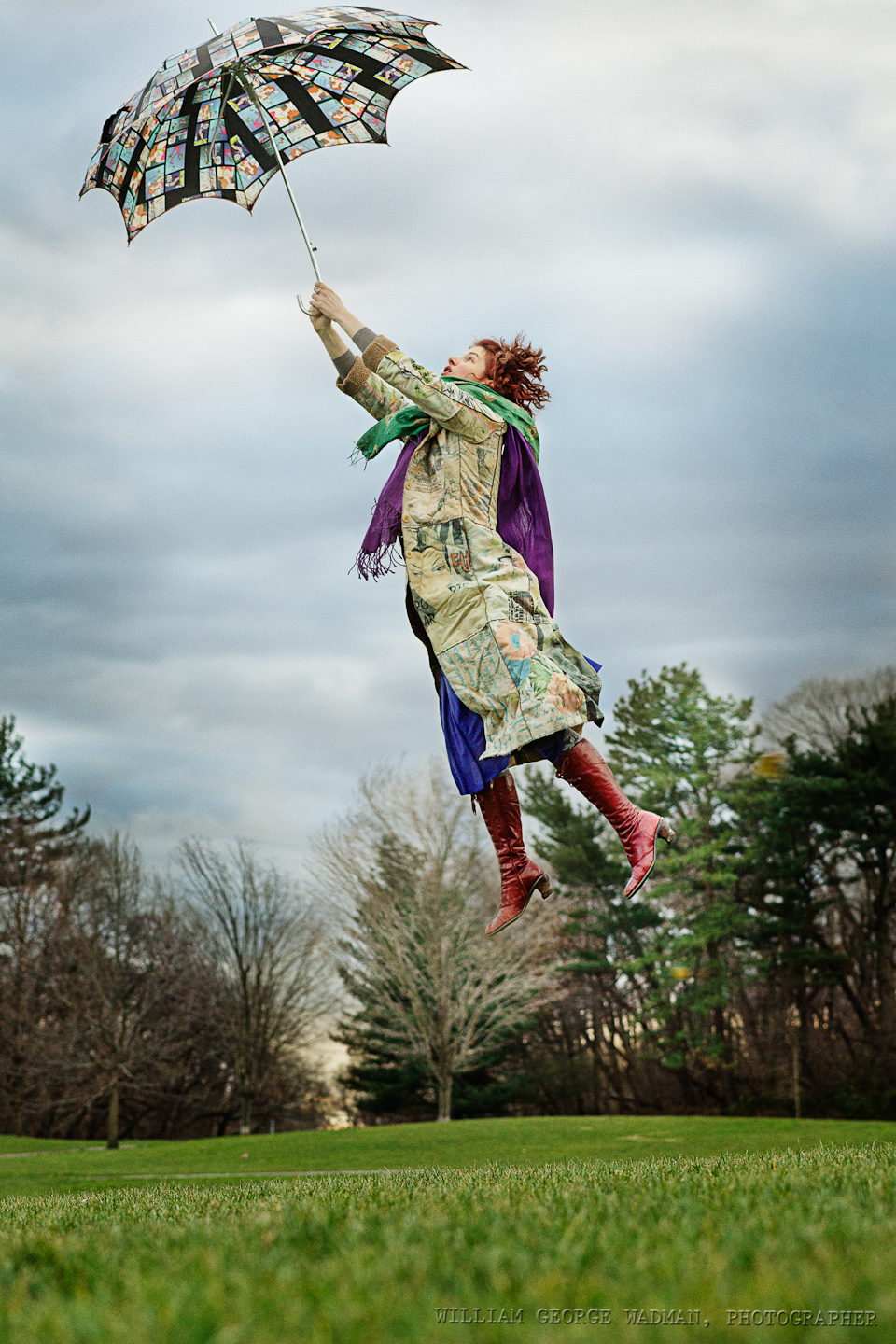
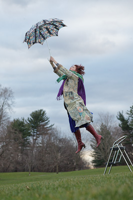
Crazy windy day gave me the idea of having someone actually picked up by their umbrella. Had Annie jump off a foot stool and then later comped her into a plate shot taken a few minutes later. Available light on a cloudy day. Had to shoot at 1600 ISO to get a fast enough shutter speed to catch her in mid air.
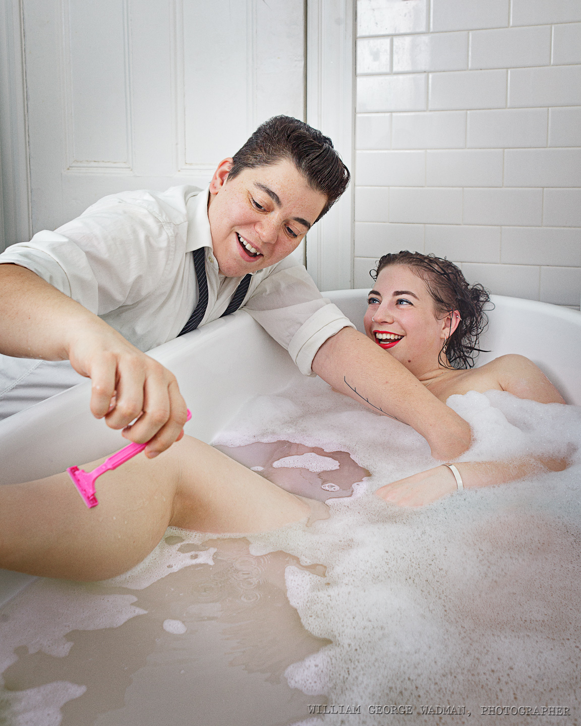
29: Bathe
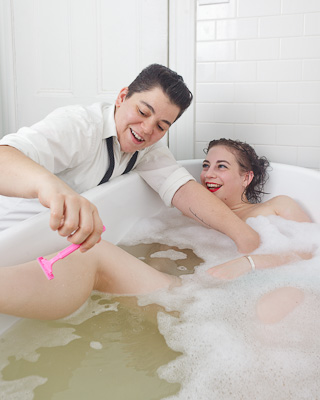
Zed (the on with the razor) and I talked a few months ago about doing a shot with her washing her girlfriend’s hair in a big old bathtub. My friend Dave has one which I shot him in during my Drabbles series a couple years ago and he kindly volunteered it again. There was windowlight but not quite enough of it for the aperture I needed so I ended up bouncing a speedlight off the ceiling which in a white tile room just bounces it everywhere. Wished that I could have backed up and used a slightly longer lens, but the space is quite cramped so I had to go wide and try to minimize the distortion of the size of her leg for instance. Though I think it makes the razor and her hand more interested and 3D.
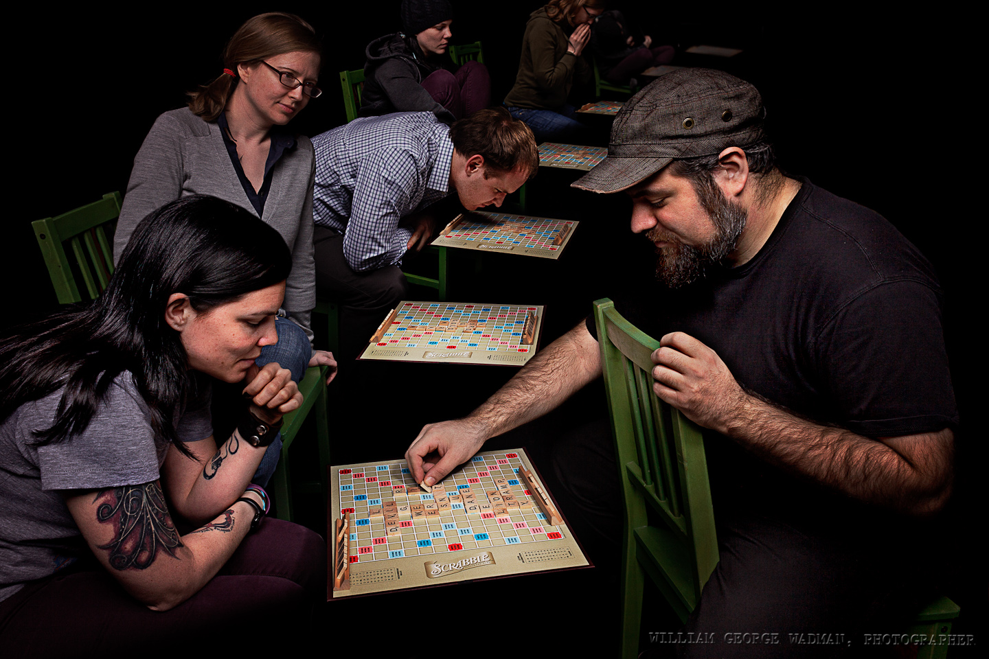
30: Gaming
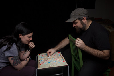
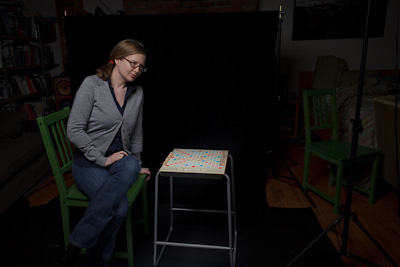
My buddy, frequent assistant, and podcast partner Dan is a Words with Friends nut, and plays with a number of people at any one time. So I thought it would be fun having him playing everyone at once in a virtual blackness. Overhead softbox and additional gridded strobe straight onto the game board. Moved the camera in relation to the board and took several shots which I composited together.
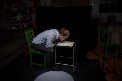
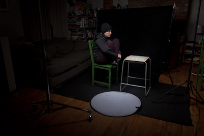
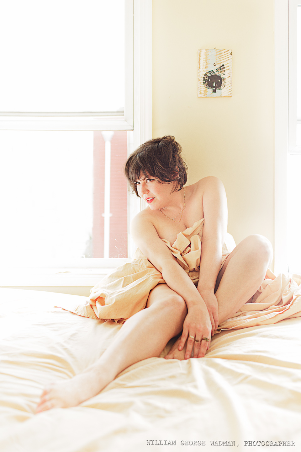
31: Boudoir
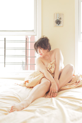
Eleanor is one of my favorite people. So on the morning of New Year’s Eve I went round to her place and spent an hour shooting her rolling around in a sheet on her bed. It’s a tough job people, it really is. I wanted the bright sunlight but wasn’t getting enough so I put a monolight out on her fire escape and then laid a big 4×6′ diffuser right outside the right window, effectively mimicking as much sunlight as I wanted.
Setup Notes on the December Portraits (Part 2 of 3)
Here’s the second in a series of posts explaining the how of the December Portrait Series. If you missed the first 10, here’s the post from yesterday. Enjoy.
11:Evergreen
One speedlight with a 36″ shoot-through umbrella camera right. I wanted to do it all in one shot, but with 4 people you often have to composite together the best of each. For this one it was three pics. The men in one and the girls from the other two. The chaos of tree branches actually makes that composite a little more forgiving.


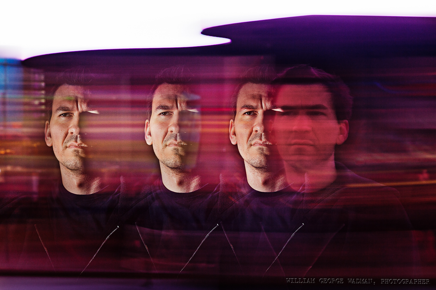
12: Multiplicity
This shot is almost exactly how it looked in the camera so I didn’t even bother showing you the before. We shot in Times Square and during a long exposure (1.5 seconds as I recall) my assistant Dan popped the flash 3 times as I panned Pat’s head across the frame. Not really the kind of picture I’d normally take, but projects like this are for experimentation, so there’s an experiment.
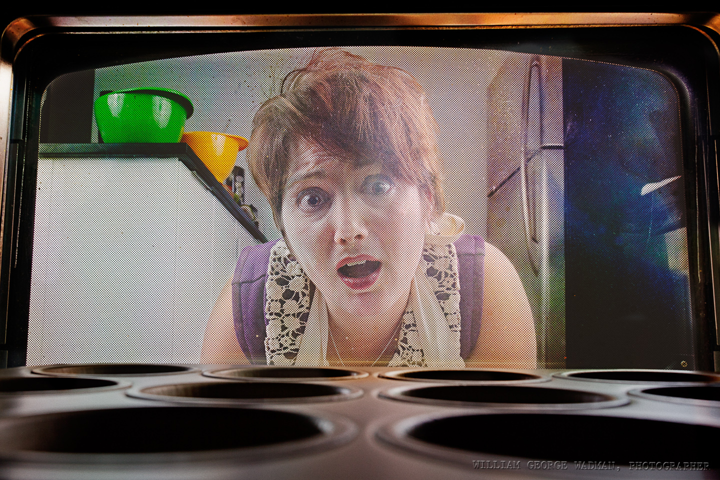
13: Cupcake
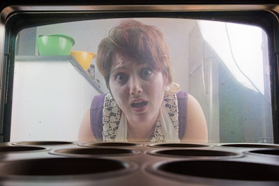
Two big soft sources, one on either side of her. Camera actually in the oven on a timer. Was a real pain in the neck to setup after each shot and required a lot of post to bring her our in the picture. Not as successful as it could have been. I realized later that it would have been better if she also had her palms on the glass in panic, or one hand on the window and the other pulling the bottom hem of the apron up to her mouth or other such exaggerated reaction.
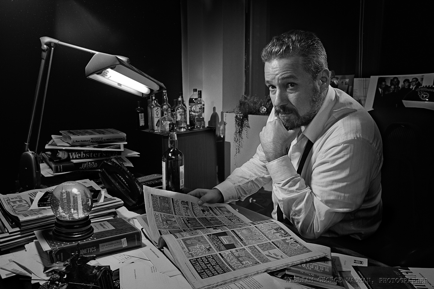
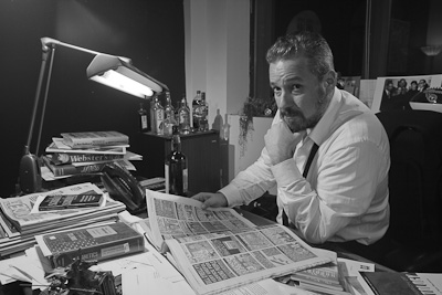
14: Newspaperman
Tony Ortega is the Editor of The Village Voice and my idea was to make a homage to Charles Foster Kane complete with snow globe (which I shot and composited in separately). Four speedlights. One with a 12″ softbox above and to the left to act as a keylight on his face. One bracketed to the window frame to the right as a rim light along his back and head. One snooted down aiming at the bar in the back. And one really low power on camera pointed to bounce off the wall behind me for fill and to trigger the rest of the lights with optical slaves.
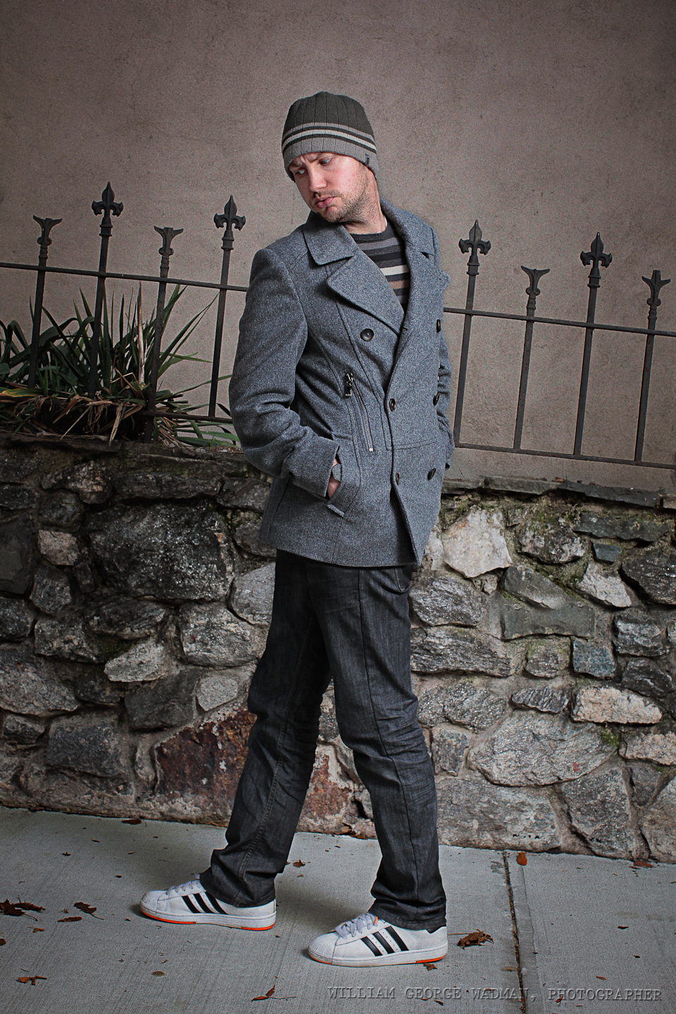
15: Twisted
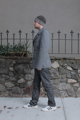
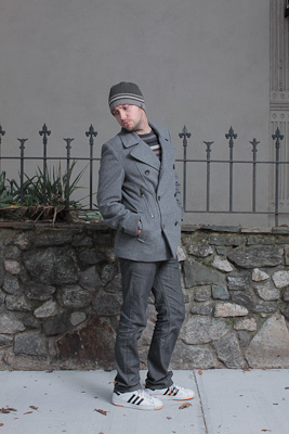
The original idea was to do something with refraction through the water in a fishtank, but it didn’t gel, so Craig and I went outside and I shot him walking in both directions in order to composite the top and botton half of him together. Lit by a 46″ umbrella on a Profoto AcuteB
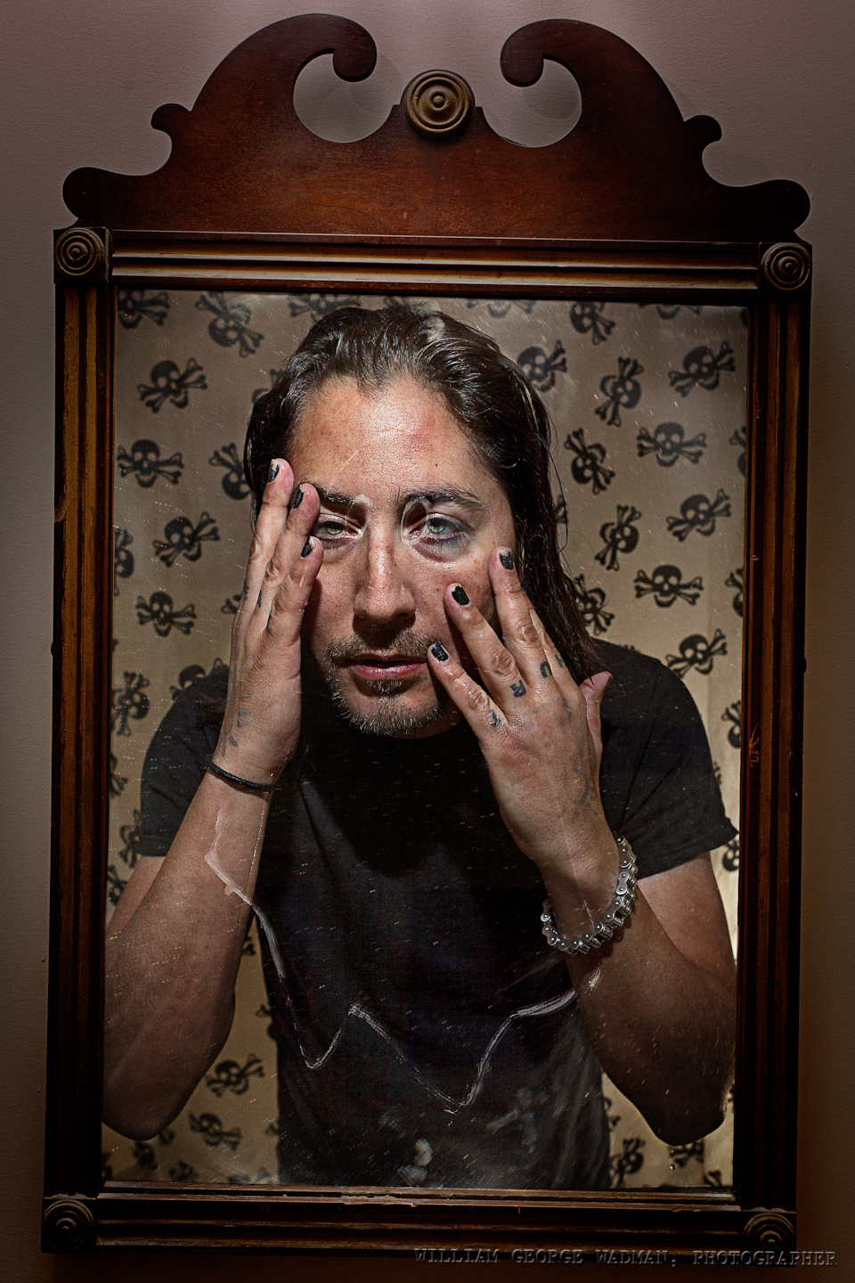
16: Reformation
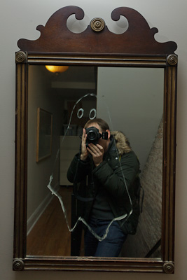
Neal is a recovering heroin addict who I shot for my drabbles series a few years ago. He is in a better place than he was before and I wanted to play with the idea of baptism and redemption. So I shot him in his bathroom with the crazy shower curtain. Two speedlights, one inside the tub and another handheld above with the diffuser panel down. Then in his hall an artist neighbor had drawn a ghost on the mirror, so I took some pictures and composited Neal into the mirror as if the camera was looking through his eyes.

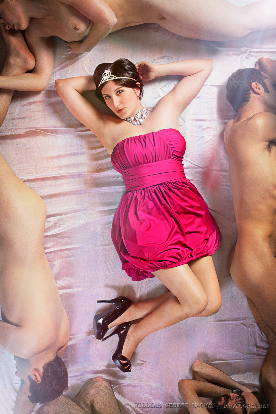
17: Princess
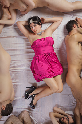
Lux is the editor of Fleshbot.com and she and I had talked a year ago about taking a picture like this. The original idea was to shoot her from above laying on a pile of writhing bodies, but it’s surprisingly difficult to get that many volunteers and then also next to impossible to get her laying across them with any grace. So instead I used the naked bodies to frame the shot along the edges and made it less raunchy and more glamorous. Two big octabanks, one top right the other bottom left. The subjects were laying down on a slightly satiny curtain I picked up at the corner store on the way. Shot from above in a friends loft which was perfect for the concept.
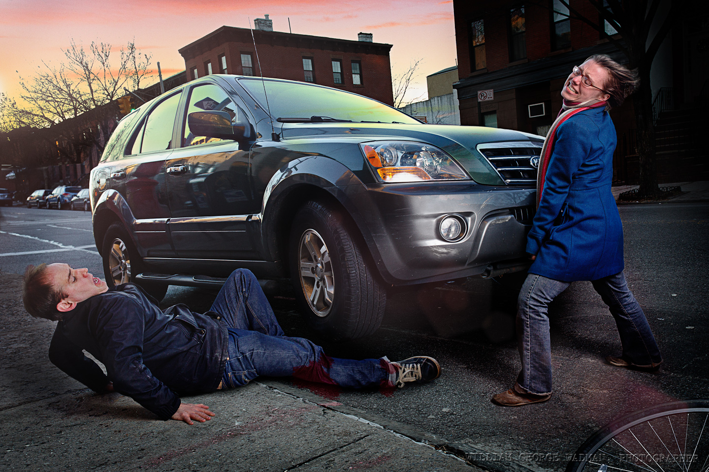
18: Rescue
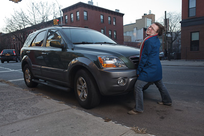
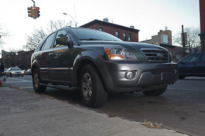
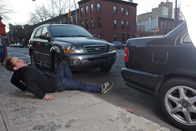
Emily, the girl lifting the car, is tiny so I though it would be fun to exaggerate the fact by having her doing something superhuman like lifting a car. I didn’t have access to the car’s jack and it was too cold out to get that involved anyway, so I instead composited a shot of her, one of the car shot at a lower angle so I could make it look lifted, and one of me on the ground as the victim of a horrible accident. The AcuteB shot through an umbrella to soften it was used in all three shots. Also comped in a prettier sunset.
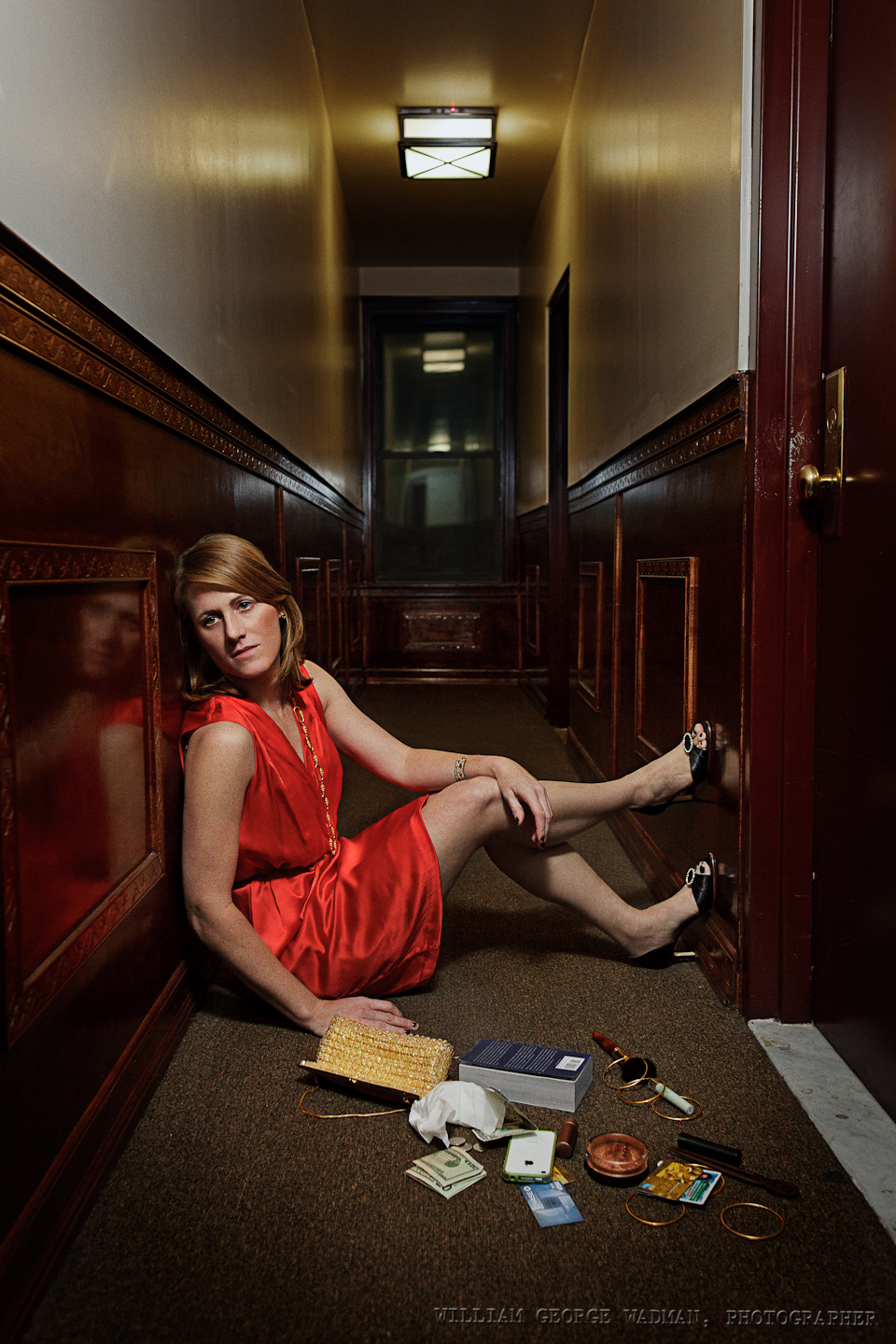
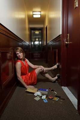
19: Keys
Relatively simple one. Shot Abby outside her apartment door, one speedlight from above with a green gel through a diffuser to match the fluorescent lighting in the hallway.
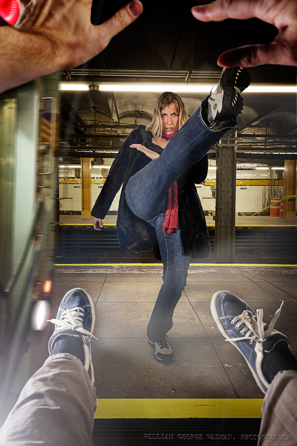
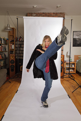
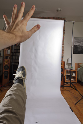
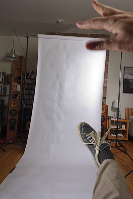
20: Kick
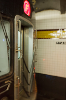
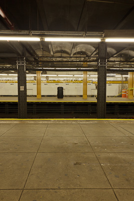
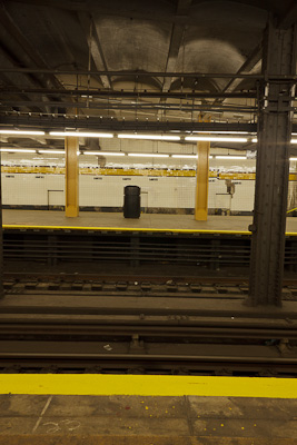
To have Aga kicking me onto the tracks we shot her in the studio kicking up a storm. Then took some pictures from my chest’s perspective and leg/arms flying forward. Then we headed to the subway and shot the from of the train as well as some pictures of the platform that I could comp together into a space. Lighting in the studio was one strobe with just reflector camera left to mimic the headlight of the oncoming train and another strobe with umbrella above and camera right to fill in shadows and give overall illumination.
Setup Notes on the December Portraits (Part 1 of 3)
A few people have asked me how I pulled off a number of shots from my December Portrait series. It’s my birthday today and therefore I’m in a good mood and have decided to write down some quick notes on each one and perhaps a small ‘before’ shot lest I forget the details. I’ll do 10 a day over the next three days. Let’s get started!
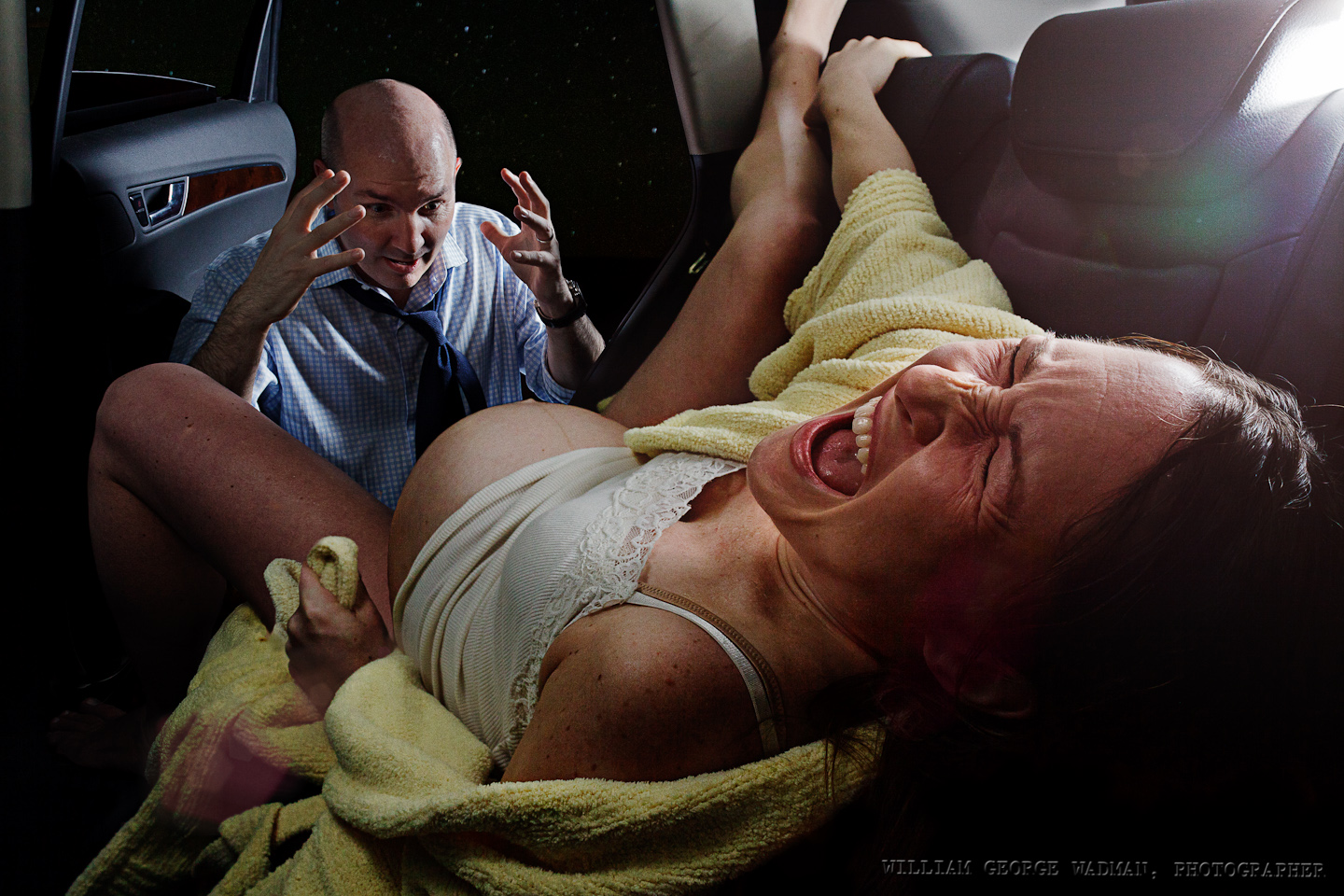
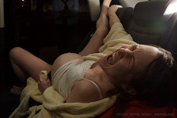
01: Birth
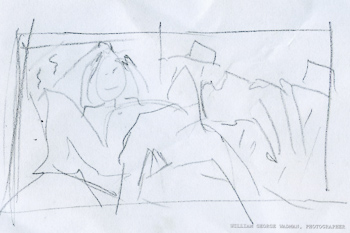
Subjects acting out the birth in the back of their SUV in a parking garage. Megan had the baby at a hospital a few days later, by the way, and both are healthy. 3 speedlights. One coming in the sunroof through a diffuser to mimic the cars interior dome lighting. One on the platform camera right shooting through a crumpled up diffusion panel from a softlighter and one light with an umbrella to the right of James and a reflector to the left just out of shot. In the end I made a composite of the best shot of each of them.
02: Horror
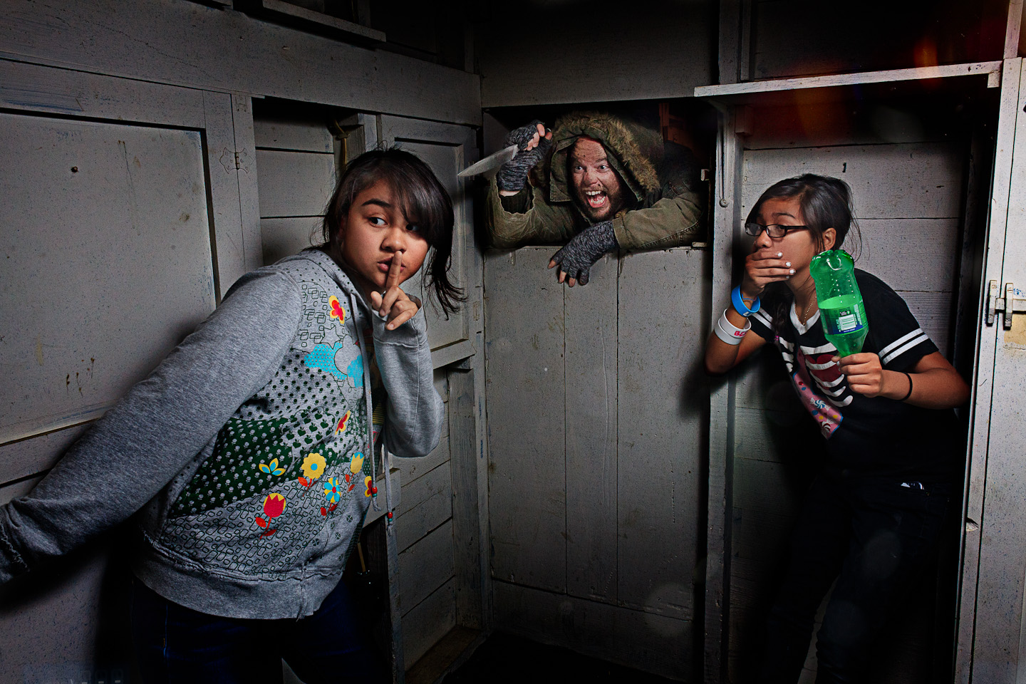
Basement of my sister’s house in Arlington, VA. Friends daughters as the victims, my very accommodating brother-in-law with soot on his face. One speedlight bounced off the wall/ceiling corner camera right as I recall.
03: Bookin’
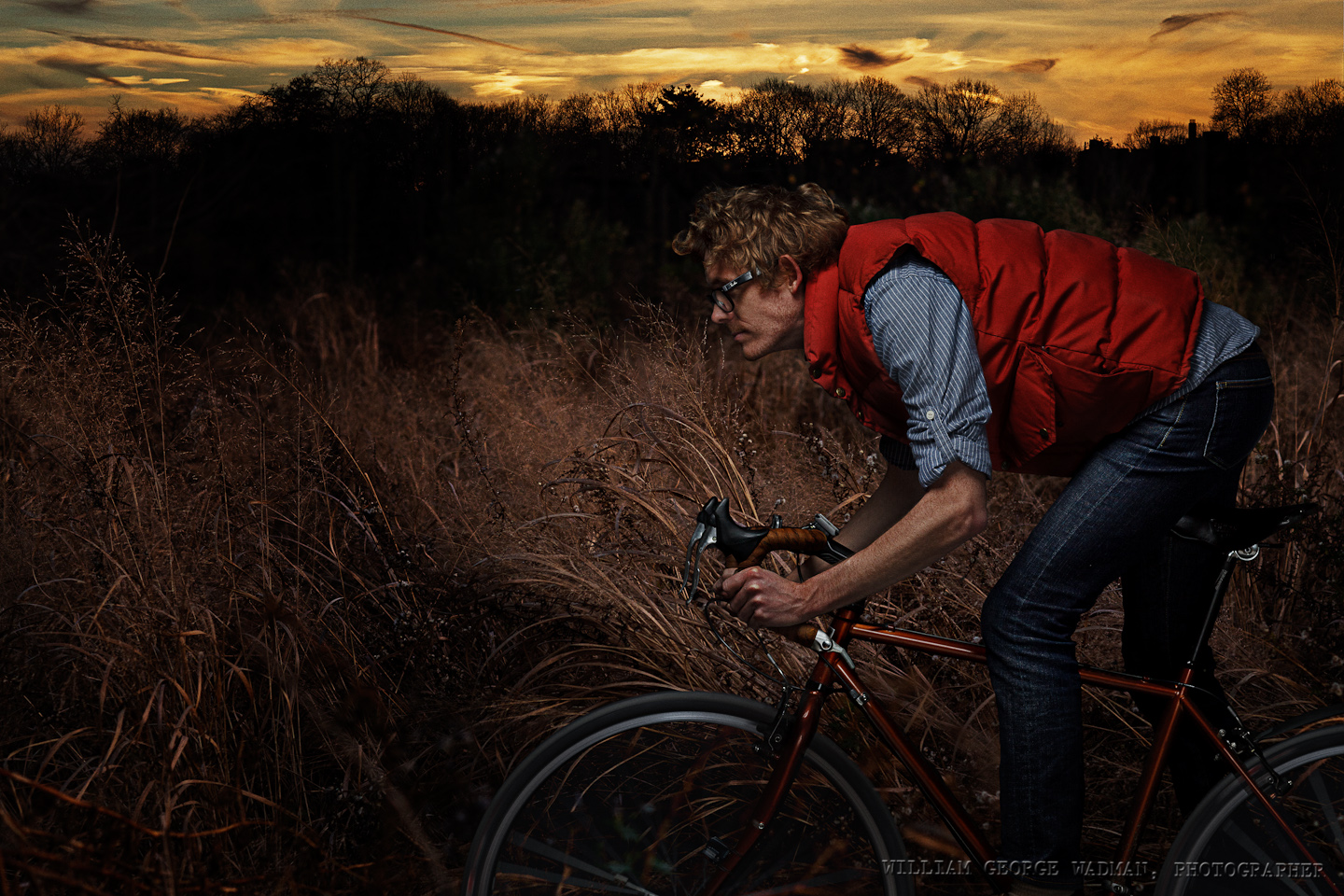
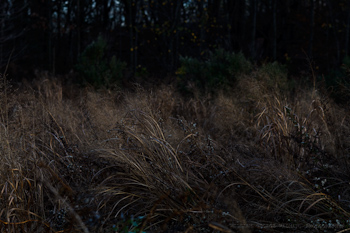
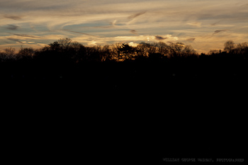
Gary shot in the studio. Two strobes, one softbox above and in front as well as a second umbrellaed strobe behind the camera at low power to fill in the shadows a little bit. Grain and trees/sunset were separate shots taken in Prospect Park earlier in the day.
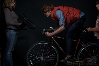
04: Theft
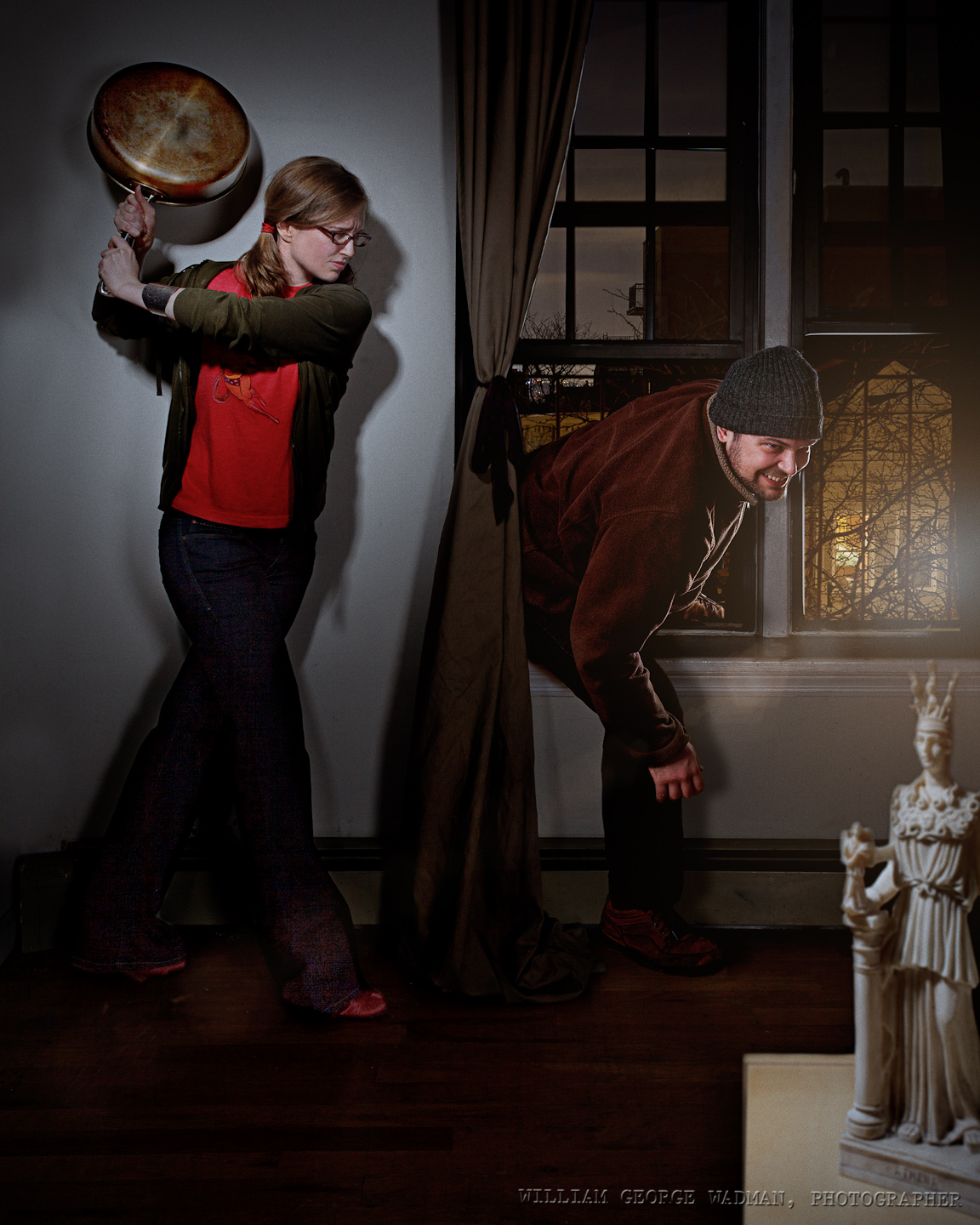
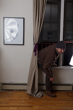
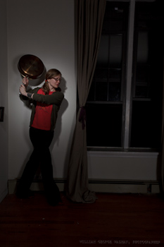
Composite of 3 separate shots. One of Heather and the pan shot with one hard strobe with grid and a reflector to fill. Another of Derek climbing in the window with softboxed strobe out on the fire escape and same gridded strobe indoors. Final shot of statue on podium with overhead gridded spot.
05: Mirror
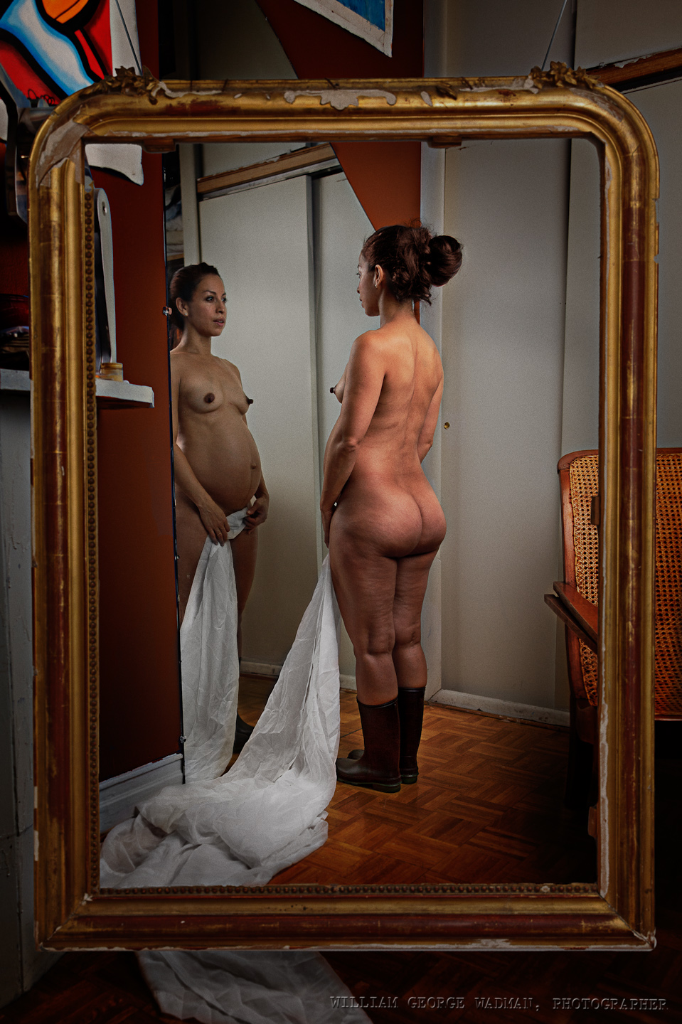
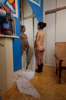
An attempt to play off a painting I saw at the Met. Main shot of girl and mirror was shot with a 48″ octabox camera right facing her back. I then shot the frame in the adjacent room with the same setup shooting through the door to give enough light. Two shots composited.
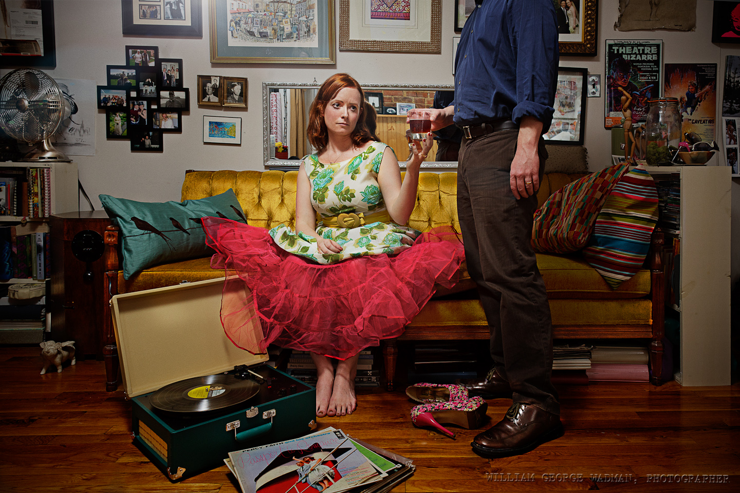
06: Party
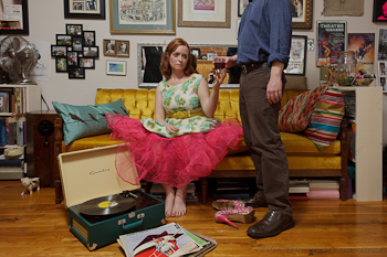
Nothing fancy on this one. Friend’s apartment for dinner and that’s what it looked like. Lindsay put on a party dress, Chris handed her a drink. Lit with a speedlight bounced off the ceiling camera left.
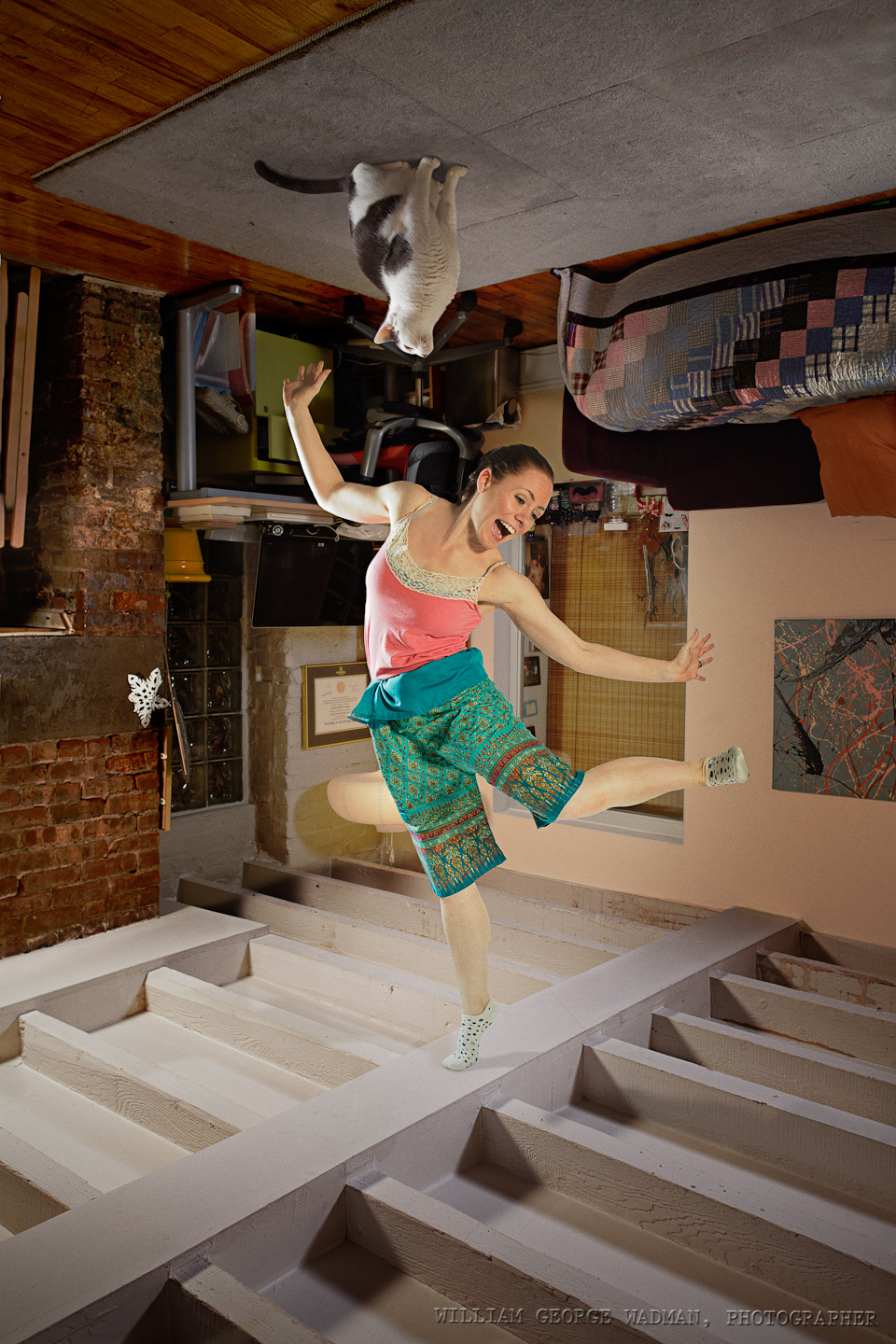
07: Dance
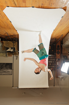
Two shot composite of course. Went to Eran’s house and shot the 7′ tall room from 3.5′ up. Two speedlights in 16″ softboxes a couple feet off the floor aiming at the ceiling. Went back to my place and shot Eran dancing with the same lighting setup coming from above. Marmo was stuck to the ceiling with glue, just kidding.
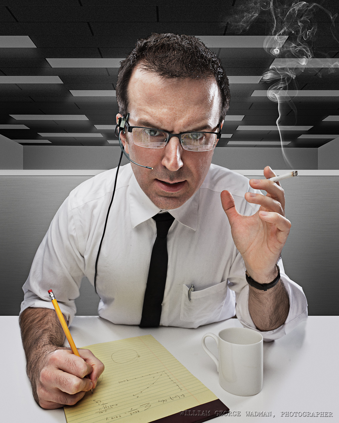
08: Capcom
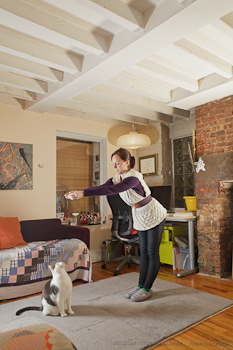
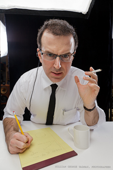
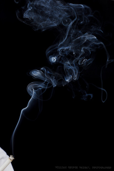
I wanted to recreate a scene from the Apollo era. Shot Chris on black background with overhead softbox and an umbrella on either side to give him some rim lighting. Shot smoking cigarette separately and brought it in in post. Headset comped in from archival photograph. Background desks and ceiling build from scratch in Photoshop.
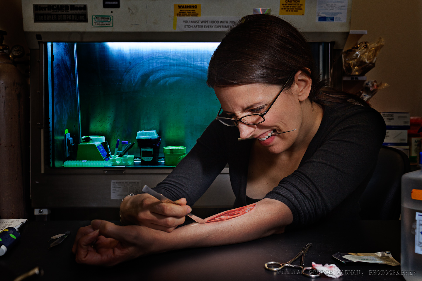
09:Vivisection
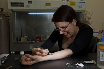
Brinkworth and I met up at the lab and shot her with a taped up scalpel and a little fake blood. One speedlight with diffuser panel held up camera right while I was taking the pictures. Later comped in found public domain shot of dissected cadaver arm.
10: Bounce
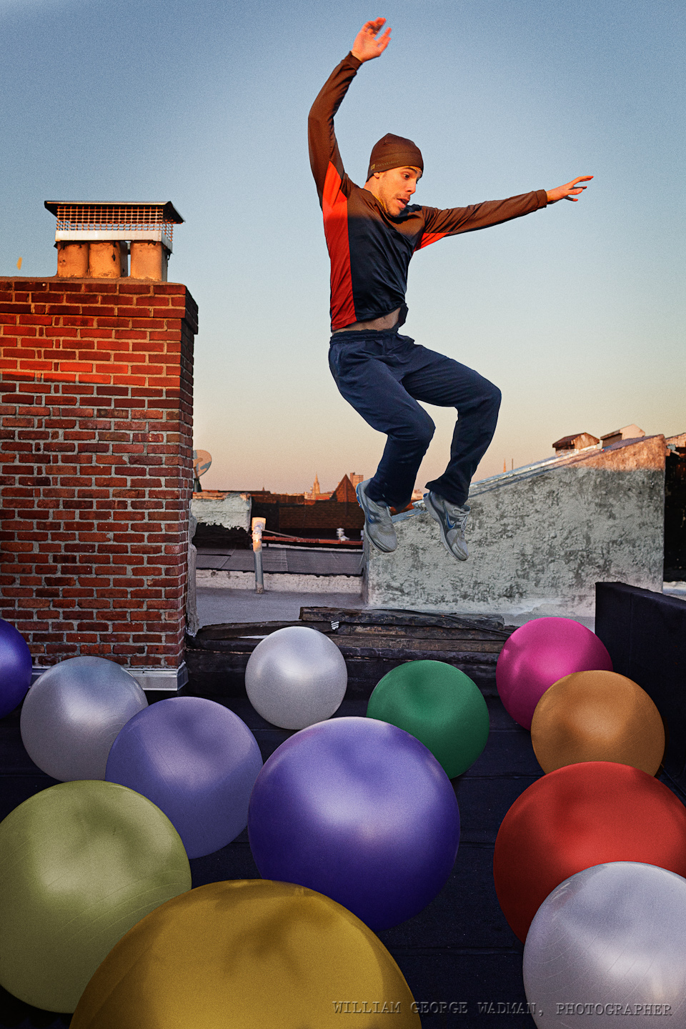
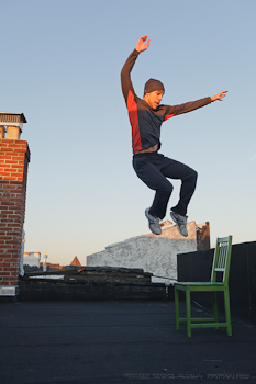
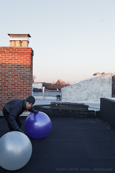
Shot Cisco on the roof jumping off of a chair. Then brought up a couple of yoga balls which we then moved around and shot in different locations. Composited and colored the balls in post. Added Cisco in bouncing about.
What I Use
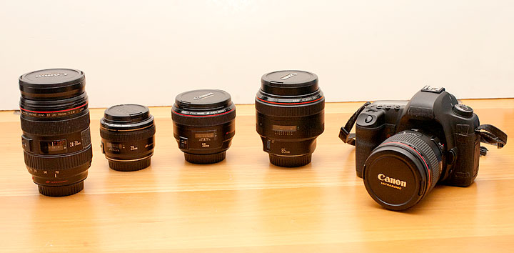
A lot of people ask me what gear I own and use. There’s nothing particularly special about my setup. I’m a pretty straight ahead Canon user with mostly nice L glass. All of the pictures I make could be made with similar stuff from other companies, but I figured I’d make a list anyway for those of you who don’t believe me and want what I’ve got.
Each link points to the product on Amazon. So if you plan on purchasing this stuff, please do it through my links so I can buy a can of Coca Cola. Thanks.
Digital
Canon 5D Mark III Body
Lenses
Canon 28mm f/1.8
Canon 35mm f/1.4L
Canon 50mm f/1.2L
Canon 50mm f/1.4
Canon 85mm f/1.2L
Canon 24-105 f/4L Zoom
Computer Gear
NEC 30″ Monitor with Spectraview Calibrator
Wacom Intuos Tablet
Apple 13″ Macbook Air
Kensington Expert Mouse
Western Digital Green 2TB Internal Hard Drives
Software
Adobe Photoshop CS5
Adobe Lightroom 4
Lights
5 in 1 Reflector/Diffuser
Canon 580 EX II Speedlite
Alien Bees B400
Alien Bees B800
White Lightning x3200
Profoto AcuteB Pack and Head
Photek Softighters – all 3 sizes
Avenger A420 Stand with D600 Boom
Film Cameras
Leica M4 with 50mm f/2 Summicron
Hasselblad 500cm
Cambo 45NX 4×5″ Large Format
Preferred Films
Kodak Portra 160, 400, 800 NC
Kodak E100 chome
Fuji Provia
Ilford 3200 b/w
Pointing Device Menagerie
For those of us not sold on the promise of touch computing, the method with which we move the cursor around the screen tends to be a very personal thing.
It all started with the mouse of course. Invented way back Douglas Engelbart at Stanford way back in the early 1960’s, but as really probably used first as we know it by the team at Xerox Parc who made it work using a ball and not direct rollers. By the way, the mouse was so named because the first one had the wire coming out the back which made it look like an actual mouse with it’s tail coming out. And of course the Apple Mac (and Lisa before it) brought all this into the mainstream.
I think my first Windows computer with a serial mouse was probably in 1990 or so? I had used an original Mac and some PCs with other windowing environments like GEM desktop (I think that’s what it was called), but Windows 3 was the first version I actually played with on my own machine. First it was two button, then the cheap mice they gave you with computers became 3 button, all of them connected to a 9 pin serial port (COM2/COM3 represent!) on the back of the computer. The one everyone wanted to use was the two-button Microsoft mouse though. It was well built, fit your hand (assuming you were right-handed) and seemed to track smoother than the crappy ones. Which brings me to cleaning. Since these mice had a ball which rolled on the surface, all this gunk got rolled up into the mouse mechanism and much of it attached itself to the rollers inside. These got nasty and you often had to open it up, pull the ball out, and clean them with some alcohol. At least that’s what the nerdy people did. I never liked mice however. You had to have room on your desk to use them, they didn’t track reliably and I found that constantly using the same pointer finger to click gave me repetitive stress problems in my hand and arm.
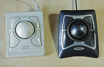 This lasted up until college and I think until I met Keenan. Keenan was a webmaster at a big software company at the time and I’m pretty sure he’s the one that introduced me to the trackball. And not just any old trackball like ones with a ball the size of a golfball which you’re supposed to use with your thumb. Yuck, those are terrible. No, I mean the big Kensington Expert Mouse. You’ve got 4 buttons, a big ass ball which apparently fit a standard size billiard ball if you were so inclined. You control the ball itself with your fingers, slowly rolling over it from the top, or flicking and catching it to zoom across the screen. Then your thumb was naturally sitting right on top of the normal left click mouse button. They weren’t cheap, I think $100 or so, but they were build like tanks and totally worth it ergonomically. To my mind, they were ergonomic before it was a computer users buzzword. And the design is still a classic to my eye. My first begat a new one when USB came around, then a dead-end model which was wireless and had extra buttons up and a scroll wheel up top. The main problem with them was the same as with ball mice, the rollers got crudded up with dirt, requiring cleaning every few days if you were sensitive to such things. Finally about 5 years or so they released the latest revision which was optical and black, and added a scroll ring around the main ball. Almost perfect. This has been my main input device on my desktop since it’s release. The paint on the main button is getting a little worn away and you do occasionally have to pop the ball out and blow dust off the sensors, but it’s nothing like trying to keep physical contacts clean. Plus it’s quieter.
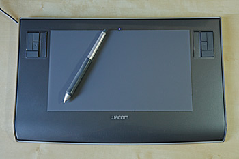 Before I got serious about photography, I used the trackball when retouching. I had played with some cheap tablets from the late 90’s on, but it never felt quite right to me. I was never a trained artist after all, so it’s not like I was yearning to hold a pen. That changed back in 2006 or so when I got a small 4×5″ Wacom tablet and forced myself to use it when in Photoshop. Once you’ve gotten used to the control of a pen, trying to do retouching with anything else is like drawing while wearing boxing gloves. When I moved to a 24″ and then a 30″ screen, I upgraded to the Intuos3 6×11 widescreen tablet and have used that ever since. For the kind of work I do, the size and shape of the tablet is related to the size and shape of the screen. In the normal 1:1 mode I use, the tablet is mapped to the screen, so the upper left corner of the tablet is mapped to the upper left corner of the screen, etc. So moving around to a specific part of the screen becomes second nature. This is unlike a trackpad where you might have to push-push-push in one direction to get the cursor across the screen. Because of this 1:1 relationship, if you’ve got a 4×3 ratio screen you want a more square tablet and if you use a widescreen display like most of us do now, you’ll want a wide tablet, so that an inch in the vertical gives the same amount of movement on the screen as an inch in the horizontal. The one problem with doing this 1:1 stuff is that if you use multiple monitors, you’re kinda screwed. This is actually one of the reasons I use a single big screen. Sure, you can make it so that it maps across two screens, but then moving the pen a half an inch to the right will move the cursor on the screen the same amount as moving the pen an inch up or down. And that kind of inconsistency is a deal breaker for me and totally defeats the purposes of the tablet in my opinion.
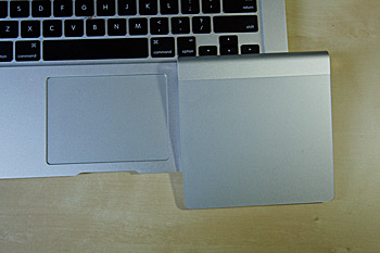 This brings us to trackpads, which is the reason that I originally started to write this post. Trackpads, especially the newer glass ones on the apple laptops, are great on a laptop. They integrate into the design, they work smoothly, and they allow advanced gesture support. All perfect for the laptop. I found myself using the four finger up and down expose gestures on my new 13″ Air so much that I started thinking about the Magic Trackpad for my desktop. That way I could unify the way I scroll pages, reduce wire clutter, and look cool to boot. As luck would have it, B&H had them for $10 less than the Apple store and I had a $50 gift card lying around since last Christmas, so I figured “why not?” Well I’ll tell you why not. The Reality-Distortion-Field strikes again! I don’t like it on the desktop at all. Sure the gestures are all there, but I find moving the cursor around on such a big screen to be very inefficient and hard on my hands. On a laptop, you can rest your hand along the side of the trackpad and edge of the case and flick around with your pointer finger, but on the magic trackpad, it’s raised on the back edge to be more like the wireless keyboard (and to house the batteries) which means your wrist either has to over-extend upward if you want to rest it on the desk, or you have to levitate your hand above the trackpad the whole time. Thumbs down. I think it’s great on a laptop, but it just feels silly on a desktop. Plus I think it’s a tad to big. Maybe it’s a great option for the Apple TV or something, but it’s not going to replace my Expert Mouse.
I’m sure there are lots of people out there who may disagree with me on this one. My friend Michael swears by his which is why I got one in the first place, but to me it’s just RSI waiting to happen.

